SCRIBBL
Creating a delightful game experience
How i redesigned a pictorial game’s UI to be intuitive so that players don't face any friction in interacting with game’s interface.
Overview
Skribbl, a deliberate misspelt form of ‘scribble’, is an online multi-player pictorial game. It is easy, fun, interactive and free to play with strangers all around the world.
Being an io game, it is designed for short and quick gameplay sessions, making it ideal for casual gaming and quick entertainment.
With 3.6M visits per month, it receives more traffic than other similar Pictionary games such as gartic.io, drawize, draw with google etc. It is widely played in the US (25%), India (12%) , Germany and UK.
Its simple gameplay is admirable but it falls short in terms of visuals, layout and copy, which made me take up this as personal project.
CONTEXT
How is Scribbl played?
Players can access the game through “https://scribbl.io”. The play can be broken down into 5 phases :
Creating or Joining a game - A player can either join the game online or create a private room and invite their friends using a link.
Drawing Phase - When a player is drawing, rest of them have to guess the word and type it in chat box to gain points.
Guessing phase - The player who guesses the word more quickly will earn more points
Choosing a word - When it is their turn to draw, they must choose one word from the three given options and draw it within 80 seconds.
Results - When the game is over, the player with highest points wins the game.
Devices
Desktop and tablet to put out creative side
The primary tasks of the game are to draw on a canvas and to type guesses in chat, making it ideal for playing on larger screens such as desktops or tablets. With the rise of digital art, tablets are increasingly preferred, but surprisingly, many people also play the game on mobile devices.
The challenge
How might we create a seemless game experience that is aesthetically modern and interactively error-free?
Key Outputs
New and improved UI
Effective positioning of information
Better copywriting
Introducing new features
RETHINKING LAYOUT
3 Screens
Homepage Layout
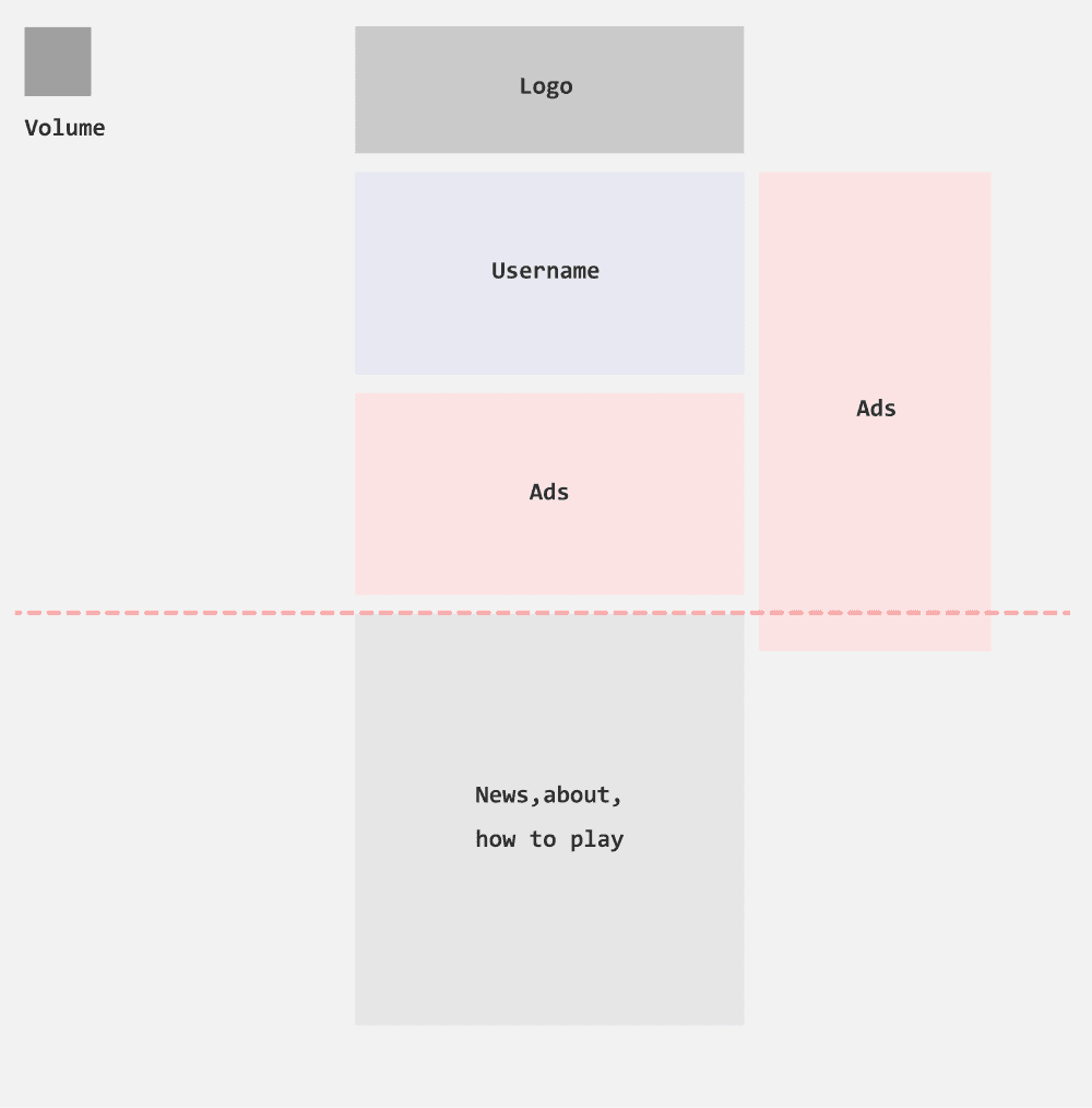
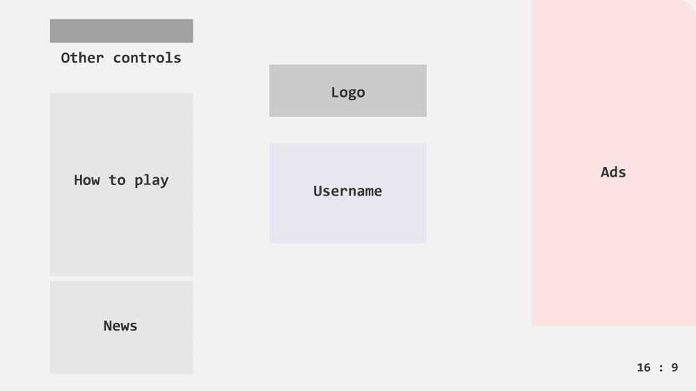
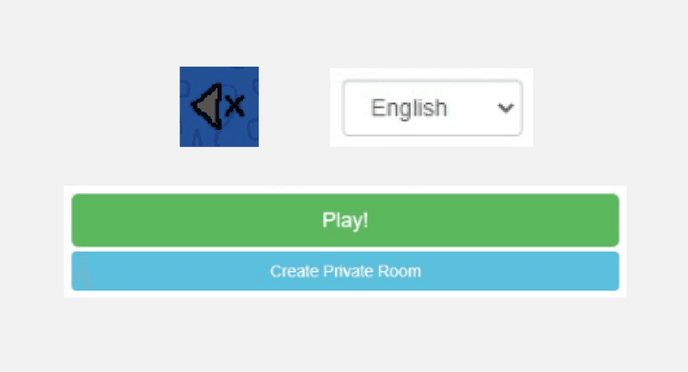
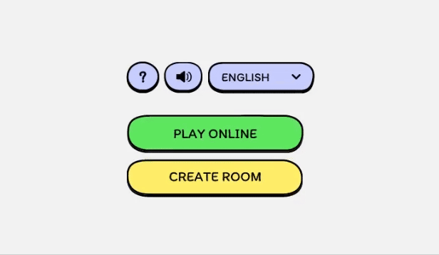
After choosing a username, users can either join a game to play with strangers or create a game to play with friends and family. The current layout features a scrollable page, which is uncommon in games.
I redesigned the layout to be a title screen with a 16:9 aspect ratio, a standard size for games, so that all the information is visible immediately.
Existing
Redesign
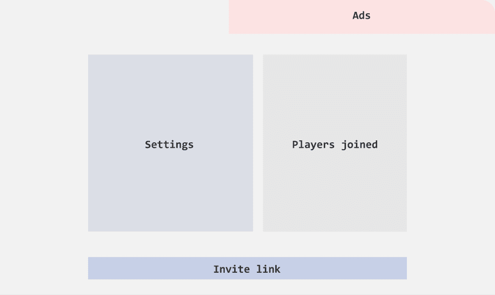
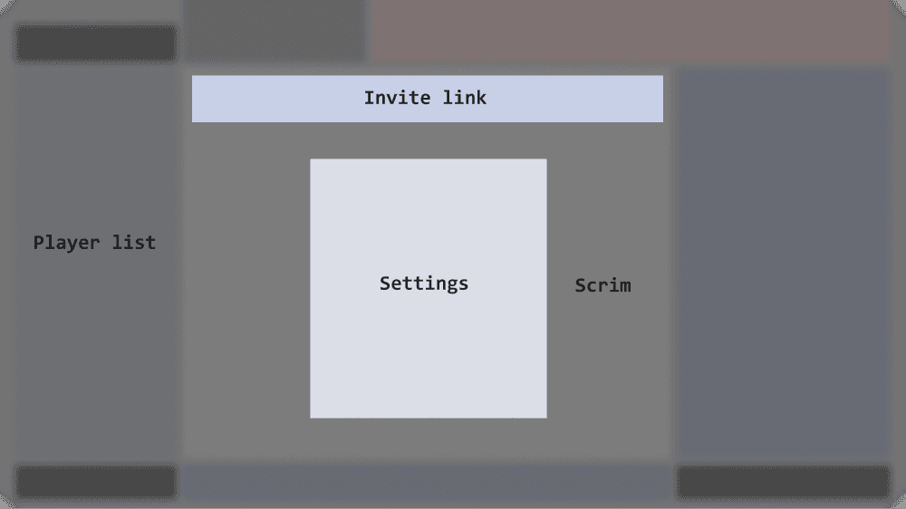
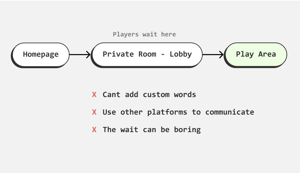
Private Room - Lobby
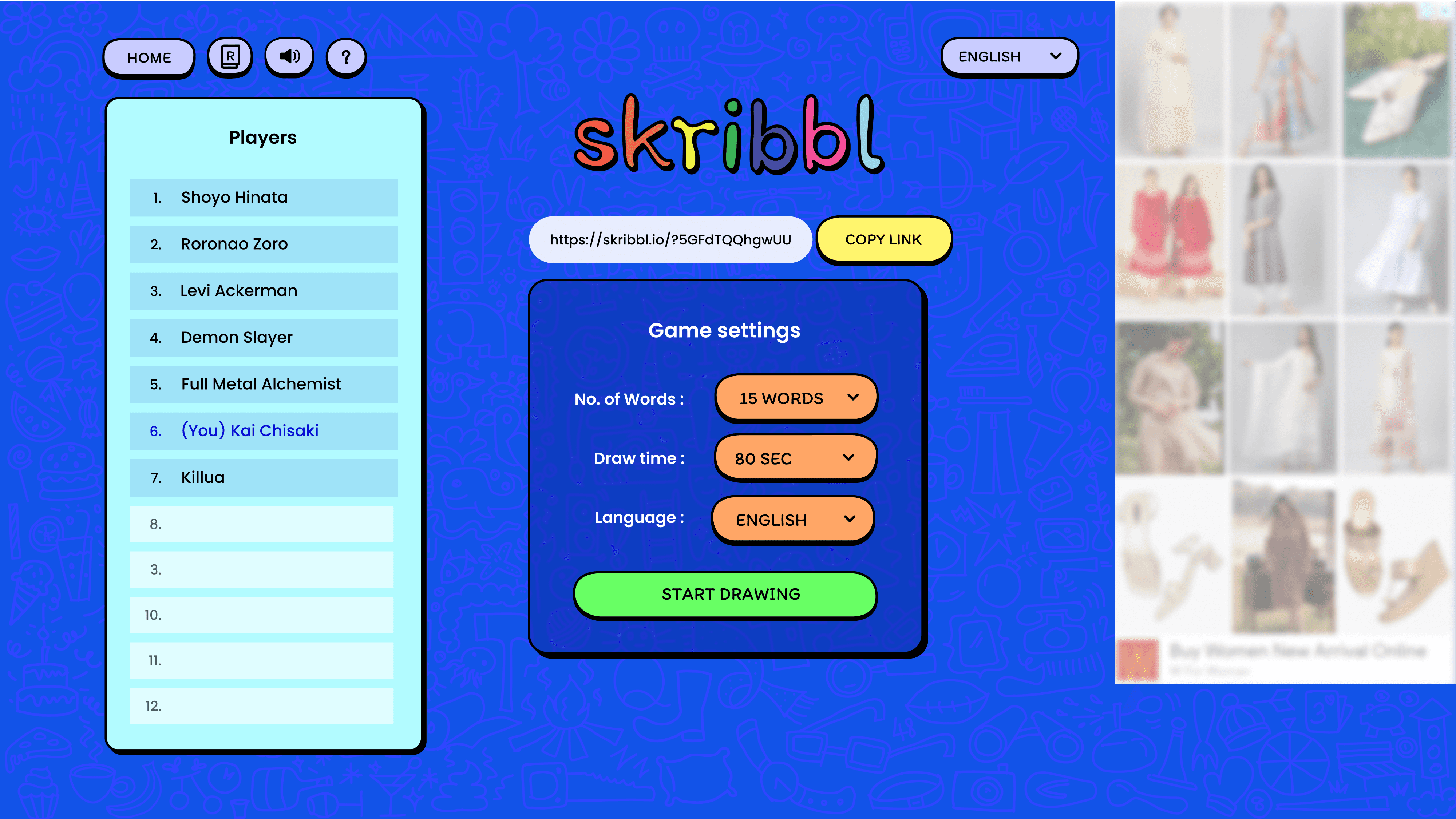
When a player chooses to create a room, they can act as the host and invite friends using an invitation link. In the existing layout, the invitation link is positioned below the fold, making it less accessible.
I redesigned the layout and user flow so that the player enters the play area directly. The settings, including the invitation link, are now displayed in a popup with a backdrop, ensuring they are easily visible and accessible.
Existing
Redesign
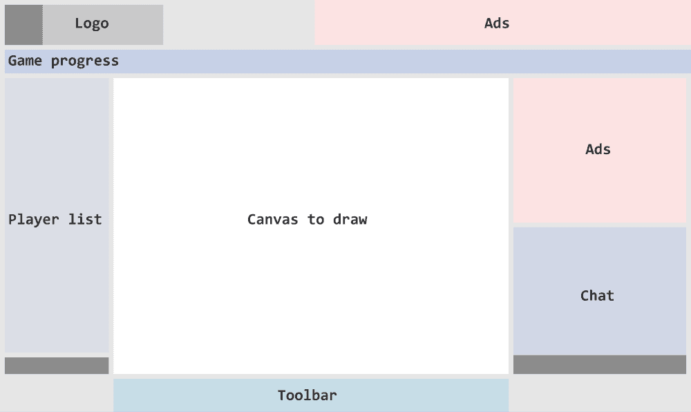
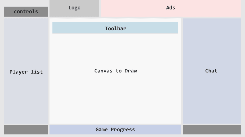
Play Screen
The player list, canvas, and chat are functional and accessible. However, the game progress ribbon and action buttons could be better organized.
I expanded the chat box to record all game progress, which provides new players with better context when they join.
Existing
Redesign
THE REDESIGN
I. Homepage
The homepage layout can be enhanced to showcase key information more prominently, ensuring users find what they need quickly and effortlessly. Although the current visuals appear unique and distinctive, they feel outdated. Updating the visuals into a more modern yet artistic style can appeal to larger audience.
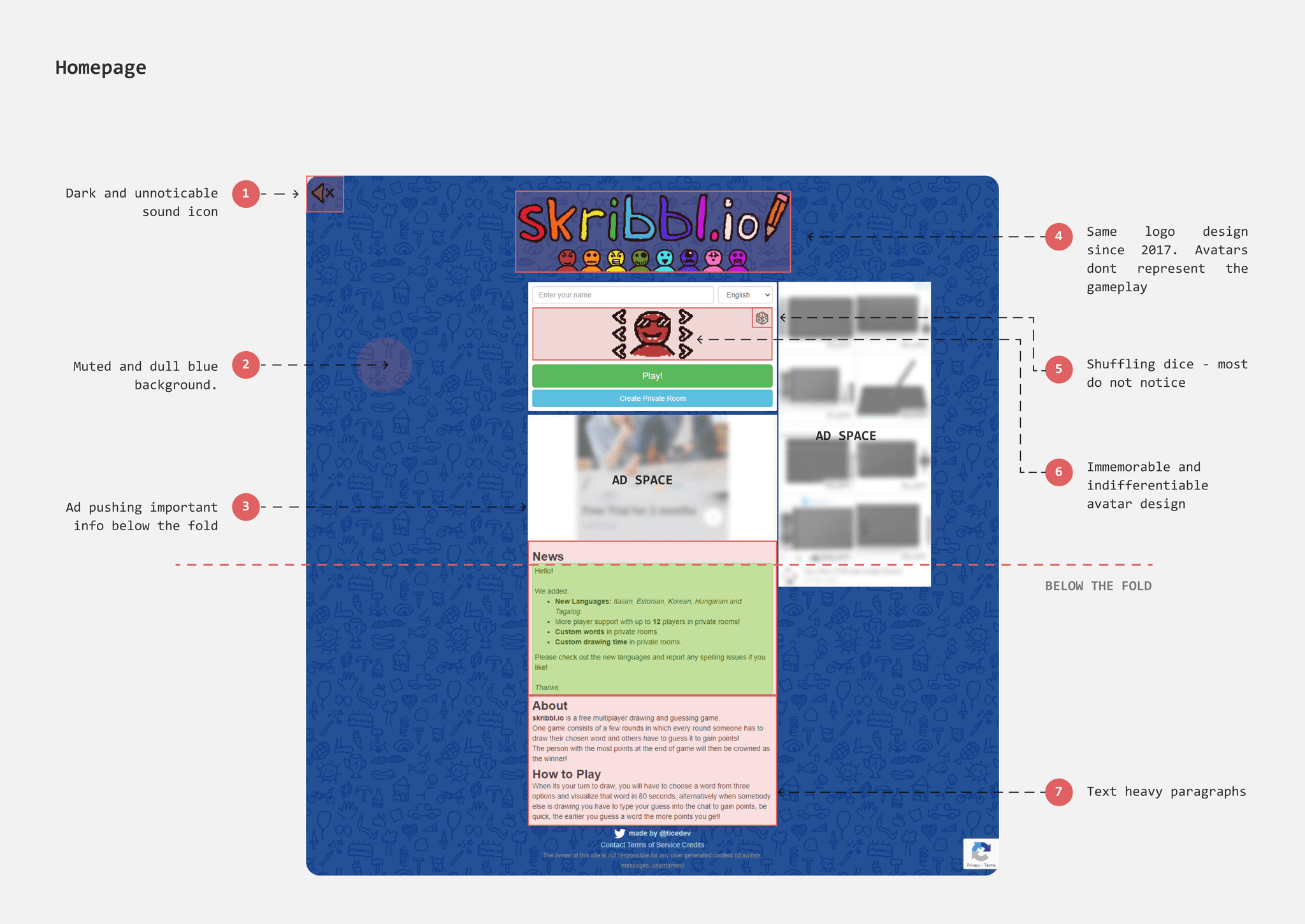
Dull and muted Background
The background color of the homepage is a dull, unsaturated dark blue, which comes across as colorless and uninviting. Although the doodles in the background highlight the game's artistic and creative aspects, they are repetitive and limited in variety, with fewer than 30 distinct designs.
The entire homepage can be made more fun and playful by selecting a brighter blue for the background. I designed a variety of doodles featuring multiple objects to serve as the new background. This diverse range of doodles can act as a visual prompt, enhancing players' imagination and priming them to think creatively.
Existing

Redesign
Outdated Visuals
Skribbl features a distinctive hand-drawn, cartoonish art style with a ‘wiggle effect.’ While this unique effect is engaging, its pixelated strokes and ragged edges can appear unpolished. Additionally, since Skribbl's art style has remained unchanged since 2017, there's an opportunity to refresh its visuals.
Maintaining the ‘wiggle effect’ as a core element of the design, I have redesigned all UI elements with crisp vector strokes and bright colors. The updated style is loosely inspired by neo-brutalism, featuring rounded corners and playful typography to create a whimsical and vibrant visual language.
Existing

Redesign
Existing
Redesign
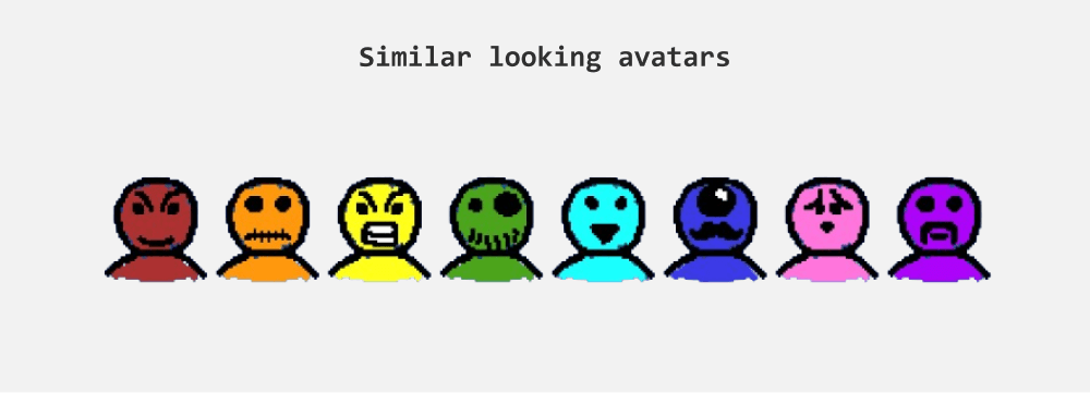
Indistinguishable Avatar Design
Players can customize their avatars by adjusting colors and facial features such as eyes and mouth. However, despite these changes, it remains challenging to differentiate and identify players based solely on their avatars, as many avatars still appear quite similar.
Existing
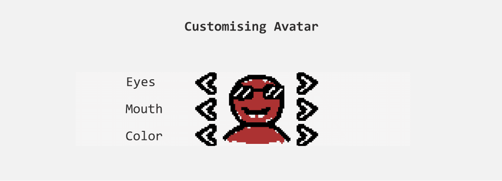
Initially, I came up with two ideas to tackle this problem:
Allow players to draw their own avatars. However, this approach could lead to inconsistencies due to the wide range of artistic styles and variations in quality, as drawing skills may differ.
Design a set of object drawings that players can choose from. Given that emojis already offer a diverse range of objects, expressions, and symbols, creating a dedicated object library seemed unnecessary.
Ultimately, I had to reconsider the role of avatars in the game. Their contribution is minimal, and players rely heavily on usernames, which serve as the simplest and most effective way to identify players.
Reasons to omit Avatars
Although avatars appear beside players' names, players primarily focus on usernames in the chat and on the canvas throughout the game. This emphasis leads players to concentrate mainly on usernames. Since avatars do not influence or contribute to the gameplay, some players choose not to customize them.
Omitting avatars would save valuable screen space, which is crucial for providing a larger canvas for drawing.
Existing
Redesign
Text heavy paragraphs
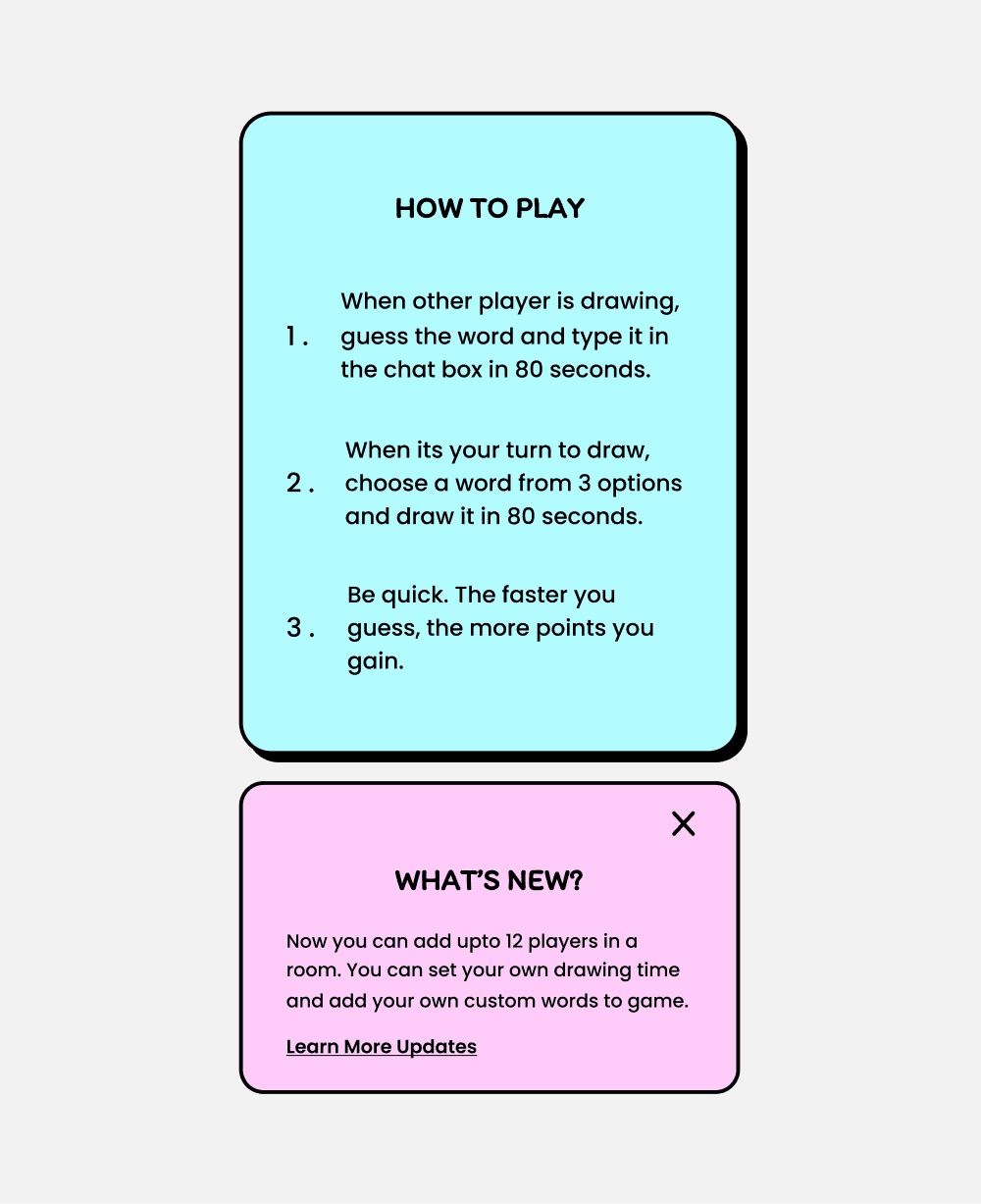
Upon Scrolling the homepage we can find News section, About and importantly ‘How to play’ instructions. Currently, this information is grouped together that appear text heavy.
Breaking down these paragraphs into bullet points can make information easier to glance and read.
Existing
Redesign
II. Private Room - Lobby
When a player clicks on "Create Private Room," a new page opens with game settings and an invitation link to add friends. This page can be interpreted as a lobby where players assemble and wait for the host to start the game. The major issues with this page are the lack of feedback and the ineffective positioning of information.
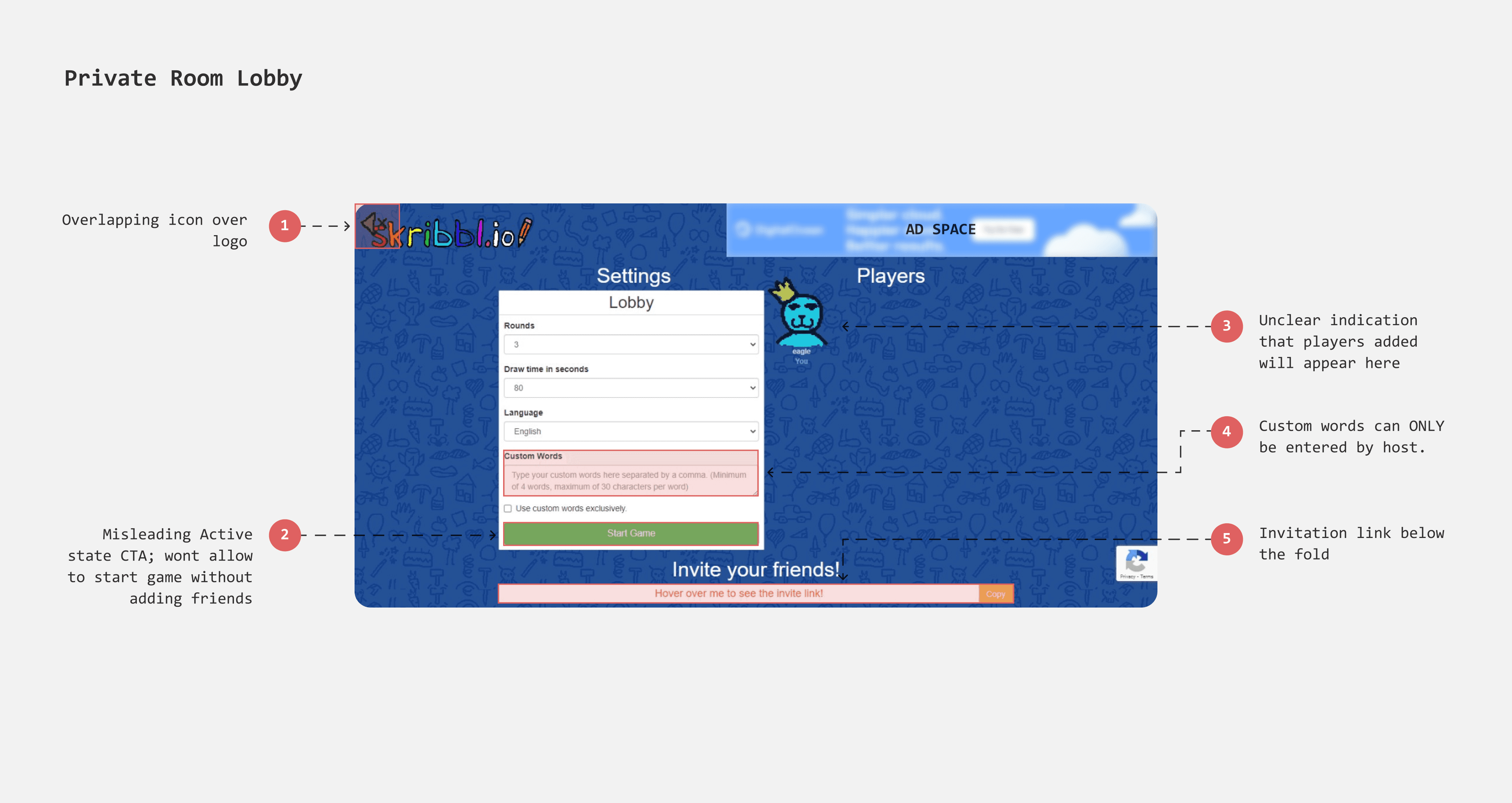
Hidden invitation link
To add friends, the host must copy and share the invitation link, a crucial step since players cannot join once the game begins. However, the link is hidden below the fold, making it hard to find. Since players don't expect games to have scrollable pages, this placement is unintuitive. Moving the link to the top will make it more prominent and accessible.
Misleading CTA
The button “start game” appears to be active even before any player joined the room, misleading host to assume that they can begin the game and players join in the next step. Furthermore there is no feedback or error message is shown when the button is clicked.
Lobby Settings
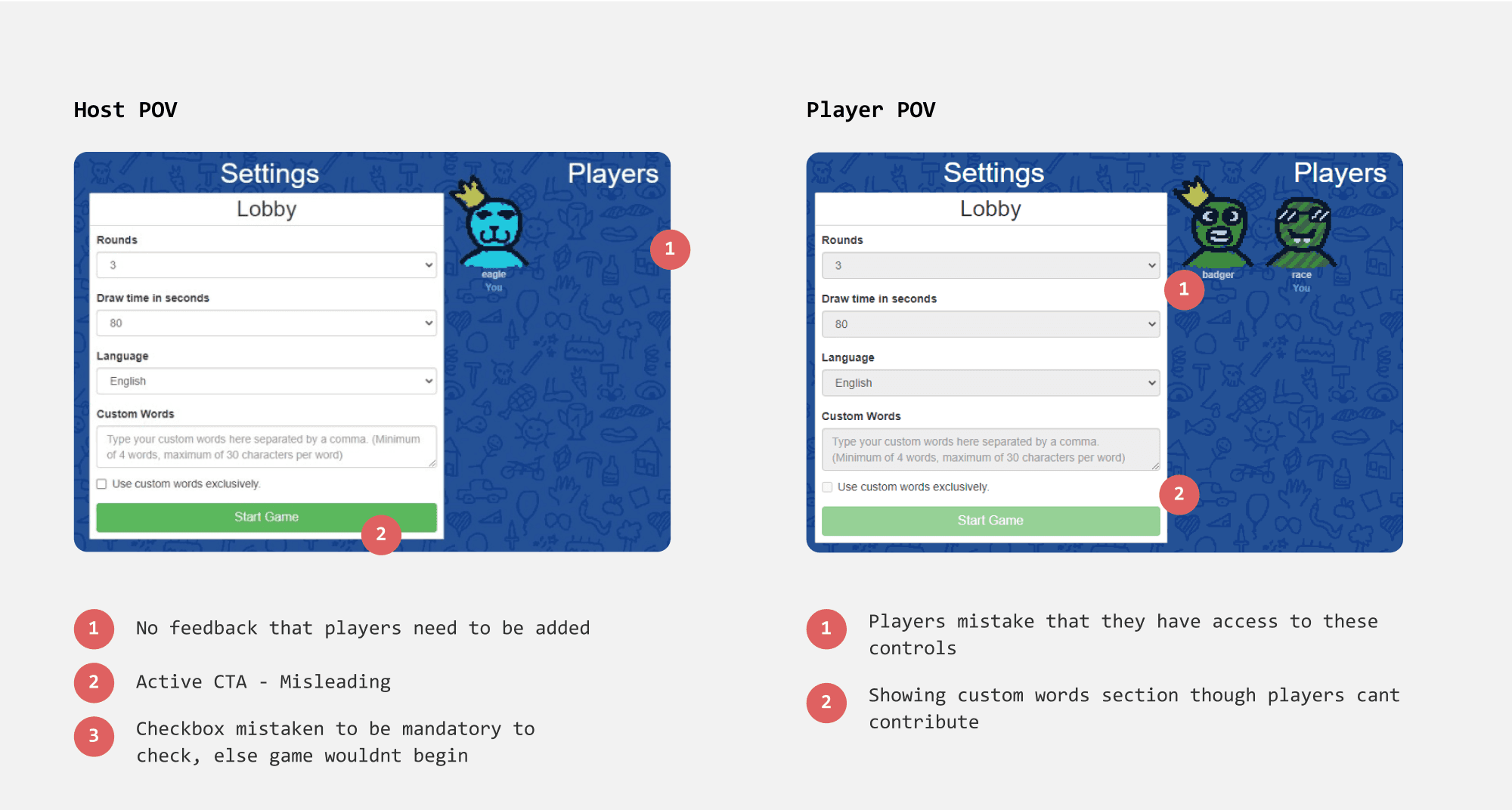
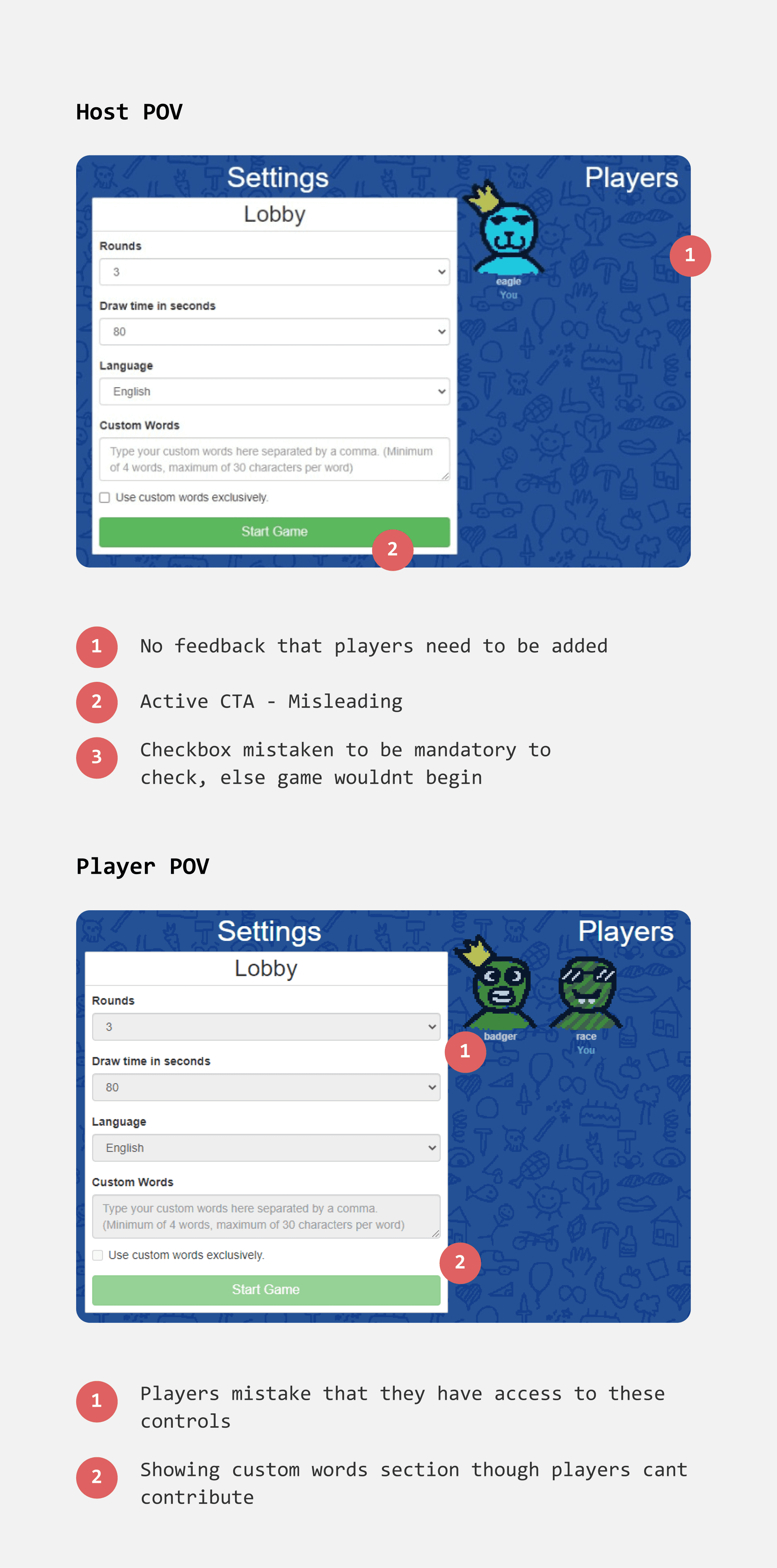
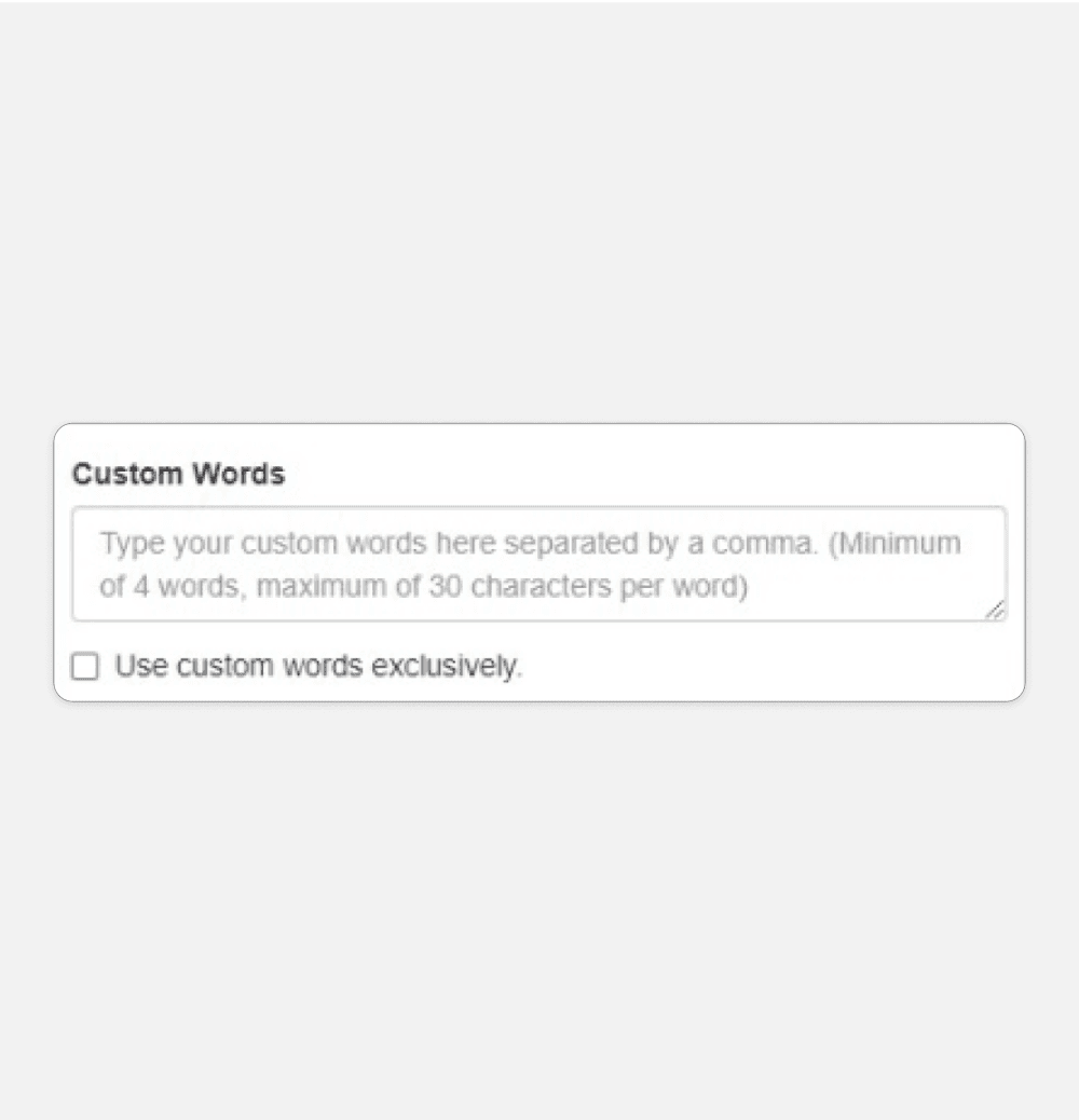
Custom words that only hosts can enter
The "Custom Words" feature is shuffled along with the default set of words within the game. However, only the host can add custom words, which feels unfair to other players. This is because custom words are part of the game settings, which are typically exclusive to the host.
Additionally, the read-only accordions in the game settings still display a chevron, misleading players into thinking they can edit these settings.
How can we allow every player to add custom words?
X Discarded Option - Cluttered UI (there are 8 buttons!)
Rethinking User Flows
As i was trying to figure out where to place custom words feature, I realised there were 3 problems that made me rethink the user flow entirely.
Adding another page to game can lead to tedious experience for player
Having custom words on a separate page would require players to go through two pages before entering the actual game, which could be tedious and potentially detrimental for such a simple task.
Communication gap
Typically, before starting the game, the host might seek consent from the other players. Currently, players need to use external platforms to communicate, which disrupts the game's visual connection.
Players can get impatient waiting
When a player enters the private room/lobby, they must wait for the host to start the game. During this time, there's no interaction to keep players engaged, making the waiting period seem annoying.
Existing
Redesign
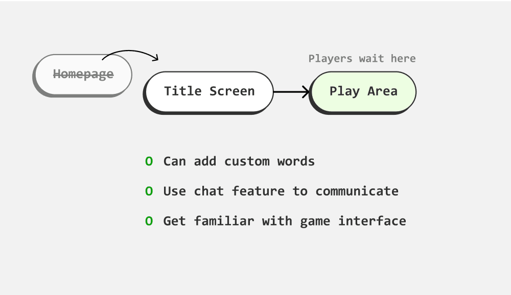
Adding Custom words - Using 4 input fields
Having 4 input fields (for 4 words), where each input field can give feedback intuitively. Also it will be easier to show error messages and helper texts in context.
Activities can be more comprehensively linked together
With the chat panel enabled, players can communicate seamlessly with rest of the players without the need of other platforms. This engagement can evoke the desire to play. Moreover, the user can get familiar with layout and interaction before game begins.
Existing
Redesign
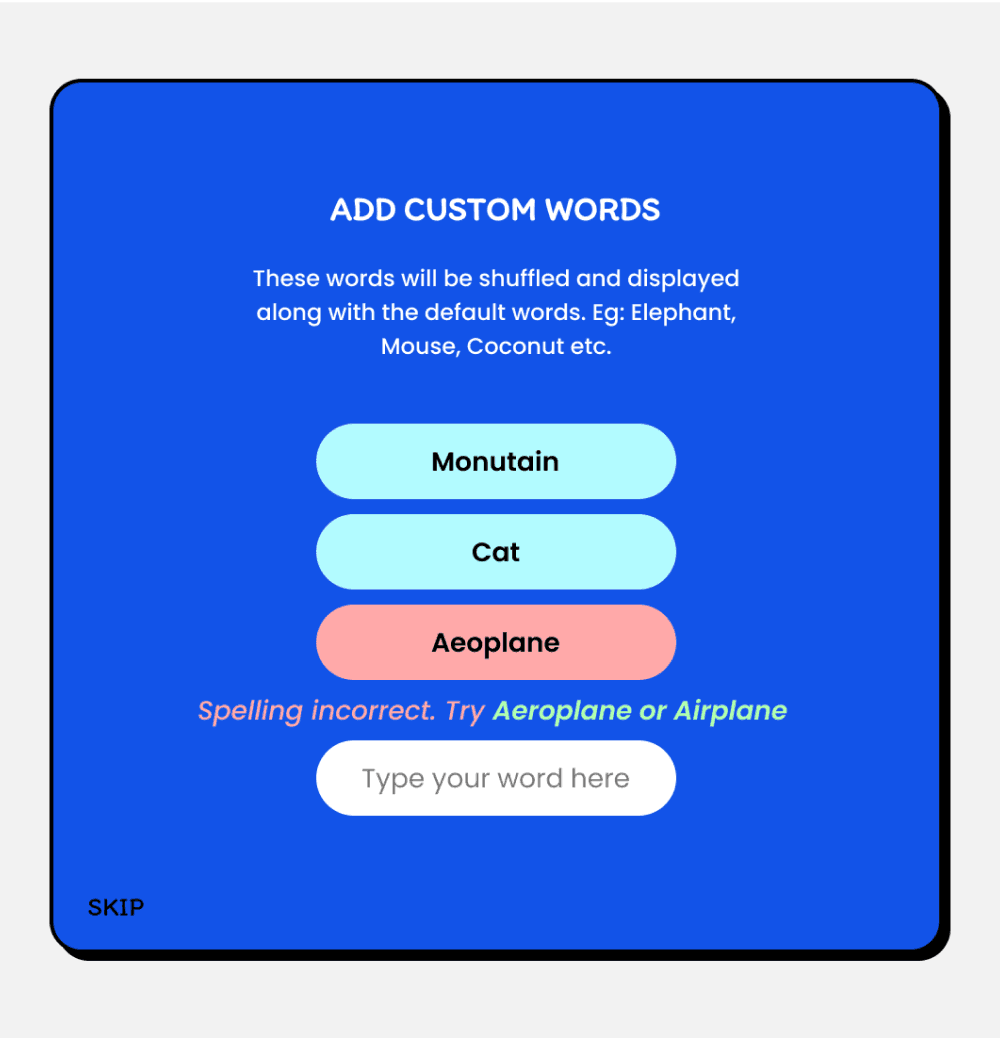
Edge cases for custom words to consider
New players might not know what are custom words
Error message for spelling mistake
Suggestive alternative spelling
Error message when the word isnt recognizable
Implementing Profanity filter
Set a limit for no. of words to be added
Should adding custom words be mandatory?
III. Play Screen
Upon joining the game, players begin to guess words and type in chat. When its their turn to draw, they choose a word from 3 options and attempt to draw in 80sec.
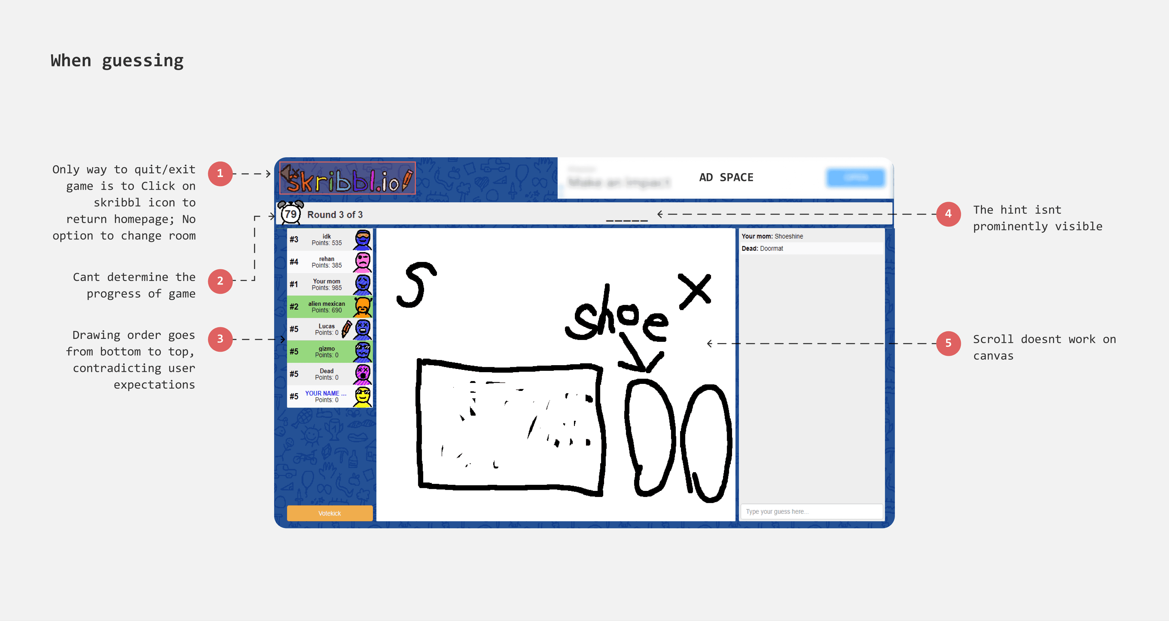
Cant change room easily
Players often encounter scenarios like joining a game in the final round, finding insufficient players, disliking the room's vibe, or wanting to play with a different group. Currently, they must return to the homepage to join a different room, disrupting their gaming experience and requiring patience and commitment to re-enter the game.
Adding a 'Change Room' feature could streamline this process, allowing players to switch groups easily without significantly impacting the game experience.
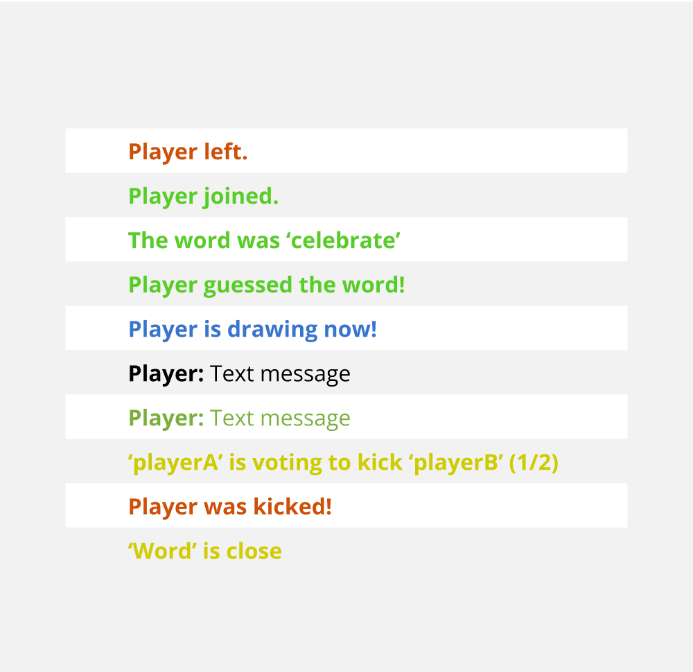
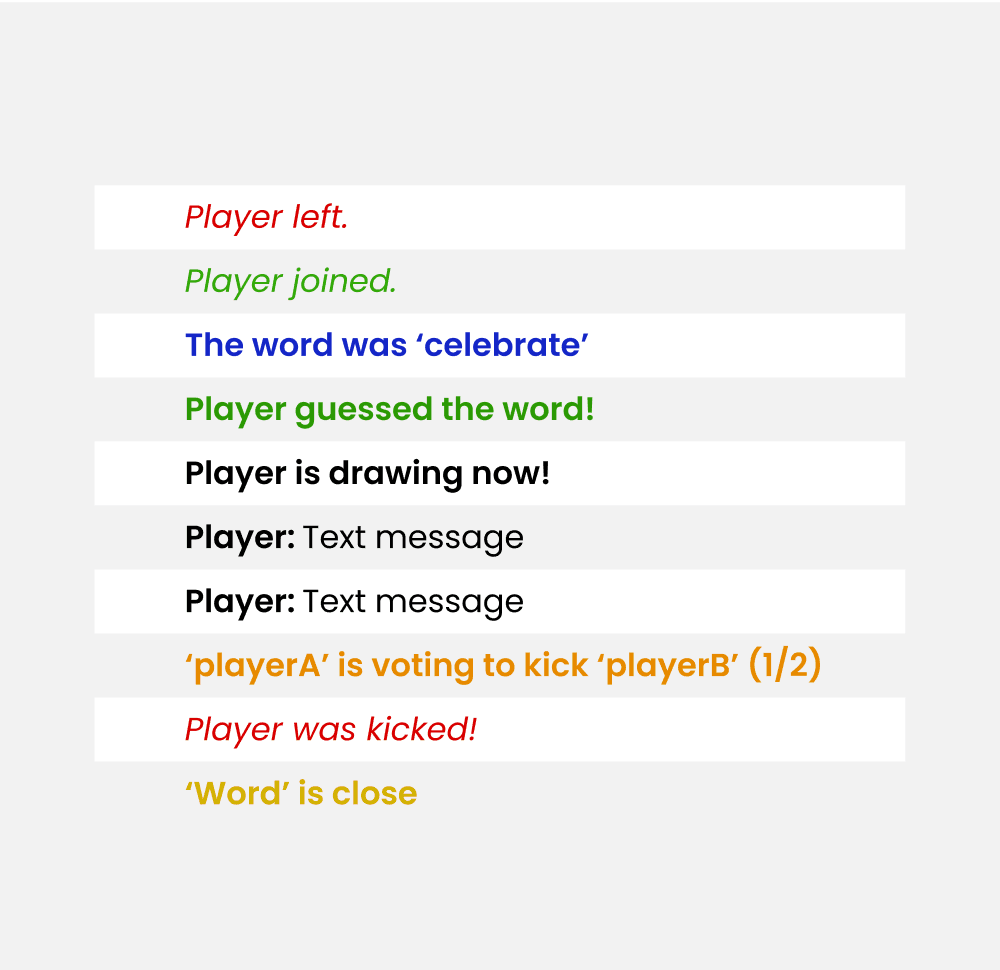
Chat panel
The in-game chat feature of Skribbl documents every activity occurring in the game, with a total of 10 activities needing distinct representation. Currently, Skribbl uses colors to differentiate each activity.
However, there are two issues:
The colors appear less saturated, lacking sufficient contrast.
Some activities share the same color code, making it difficult to distinguish between them.
Existing
Redesign
Profanity filter
As chat in Skribbl brings together people of all ages and backgrounds under pseudonymous identities, not everyone behaves appropriately, especially in unmoderated environments. With players as young as 10, it's crucial to maintain a safe and age-appropriate environment, filtering out inappropriate words and preventing bad content from being displayed.
Currently, Skribbl moderates the game by allowing players to votekick misbehaving players, but this has limitations. Players can only votekick someone when they are drawing.
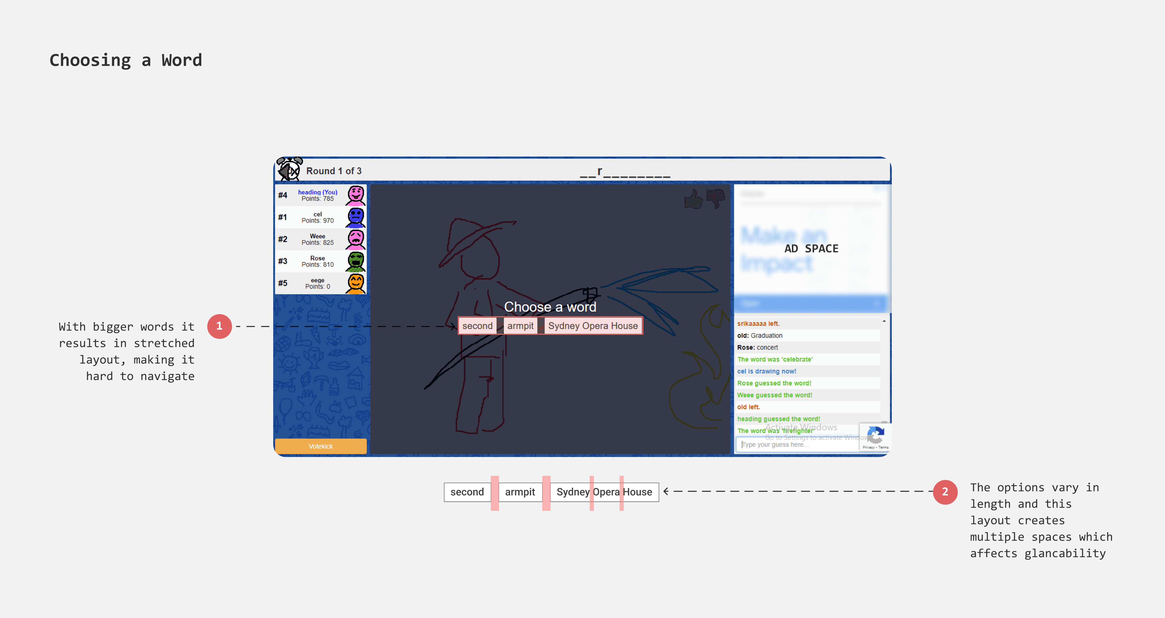
Choosing a word
Players choose a word from three options displayed side by side. As the length of the words increases, this side-by-side format results in a stretched layout, requiring users to navigate across a considerable distance on the page.
Arranging the options in a list format could make it easier for players to process and scan the choices. This format can accommodate longer words without stretching the layout and adapts well for mobile game play.
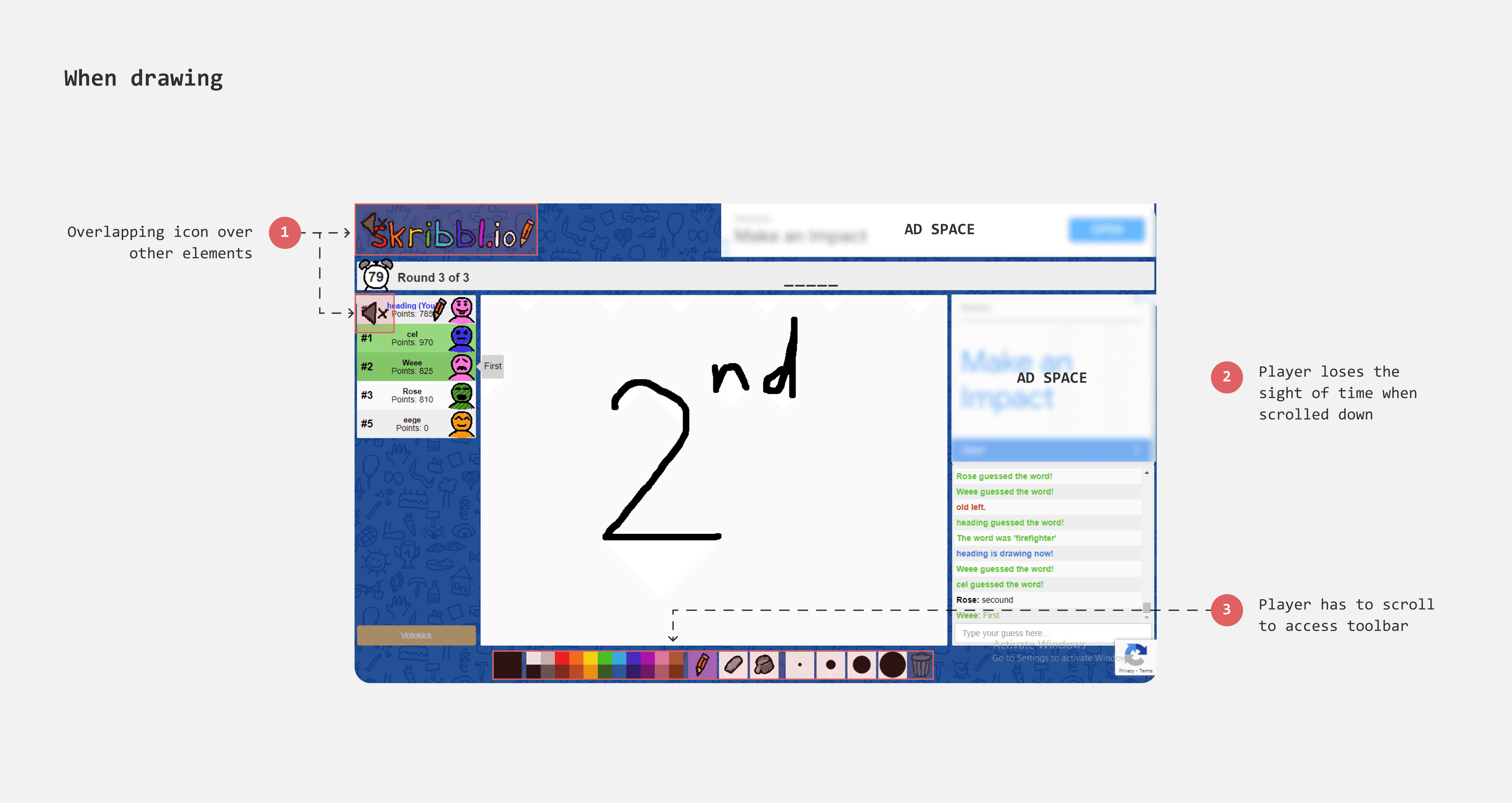
When drawing - Tool pallete
Rethinking the position of Tool pallete
The current position of tool palatte is at the bottom of canvas which is not easy to reach. Having it at top can make access easy. And considering the game will be played on tablet devices, this placement would prevent accidental palm touches.
Adding Undo & Redo
Currently players rely on eraser tool to remove strokes and delete option to wipe out the drawing entirely. However, there are scenarios where a player might want to quicky correct their recent mistakes, like the last drawn strokes. In such cases, having an undo option can help to rectify mistakes simpler. Additionally, having undo/redo tools takes away the burden to get the drawing right in the first try.
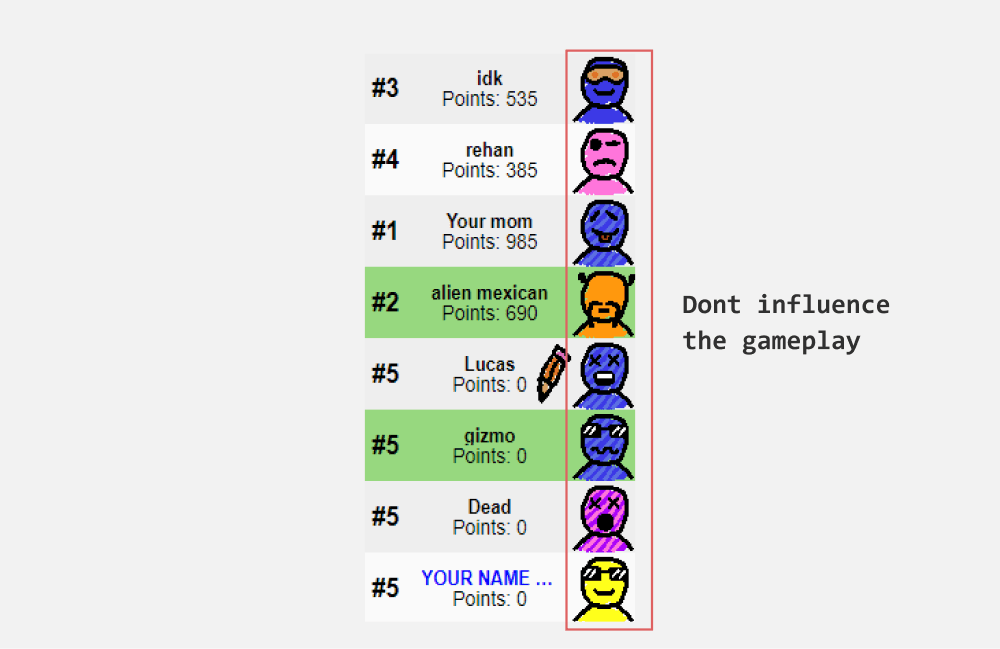
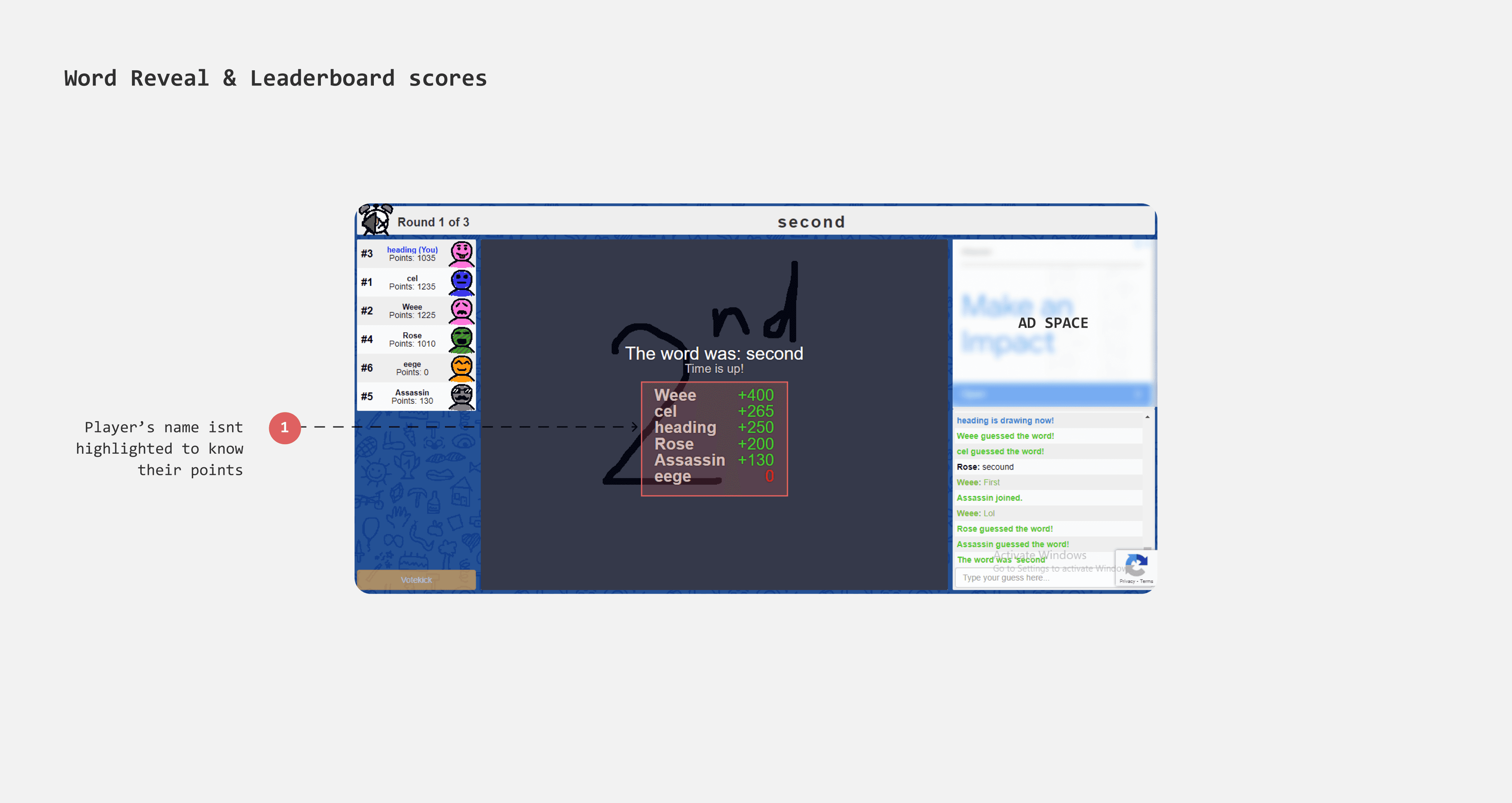
Leaderboard
Highlighting the player
Currently, the leaderboard at the end of each word reveal does not highlight the player, making it difficult for them to stand out. To make the player's position identifiable, I gave it a background color that acts as a visual cue.
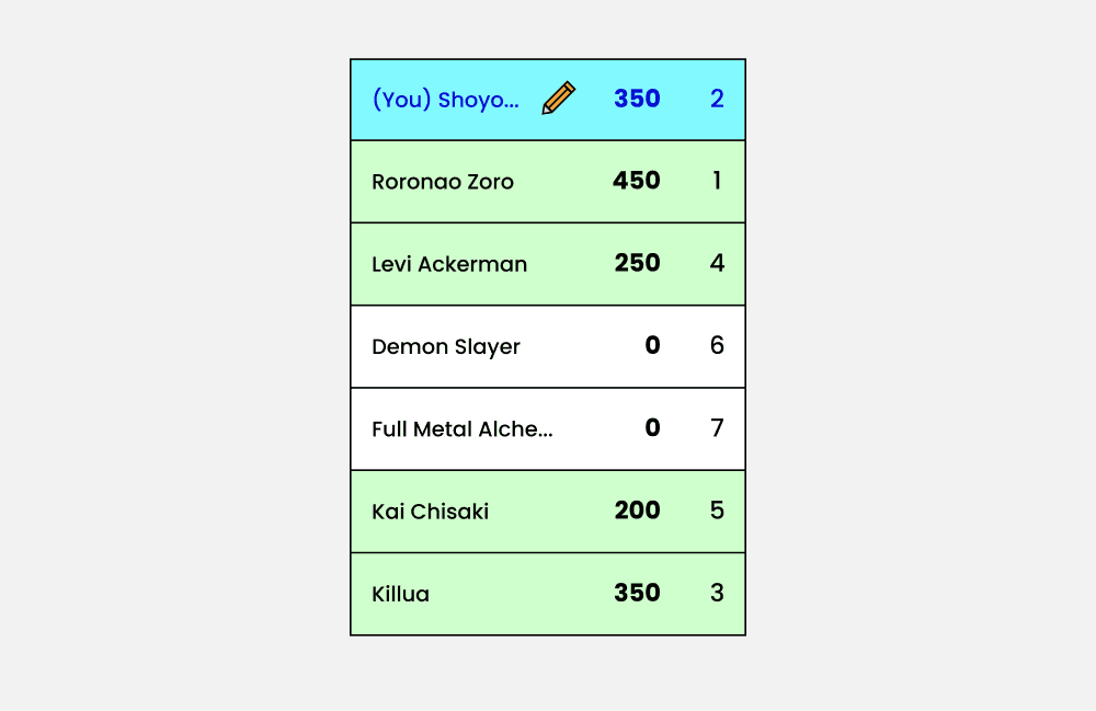
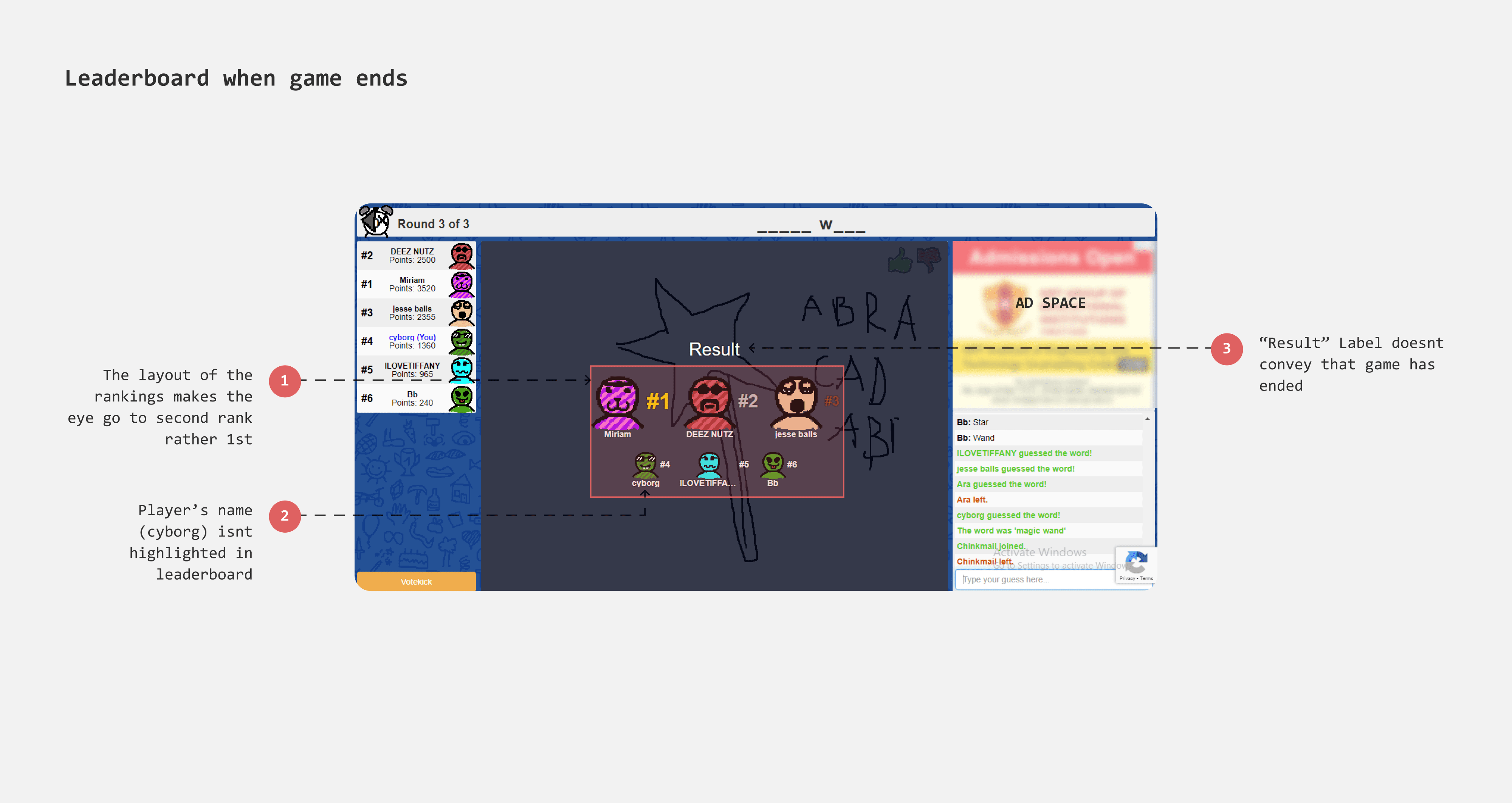
Better hierarchy in Gameover results
With a grid layout the current game results page lack heirarcy and structure. Moreover, when there are 12 players (which is the max no of players that can be played), it becomes harder to identify player's ranking. I considered a podium layout for top three rankers and arranged rest of the players in a list.
Dialogs - Error and Alerts
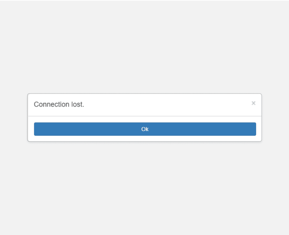
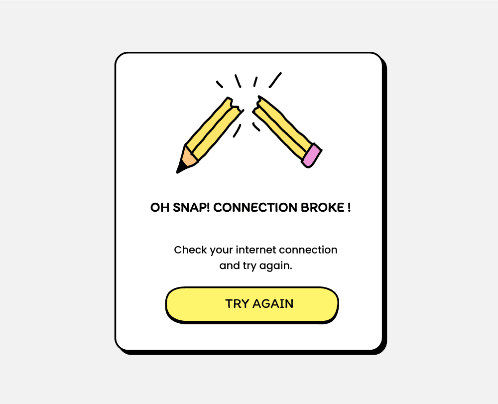
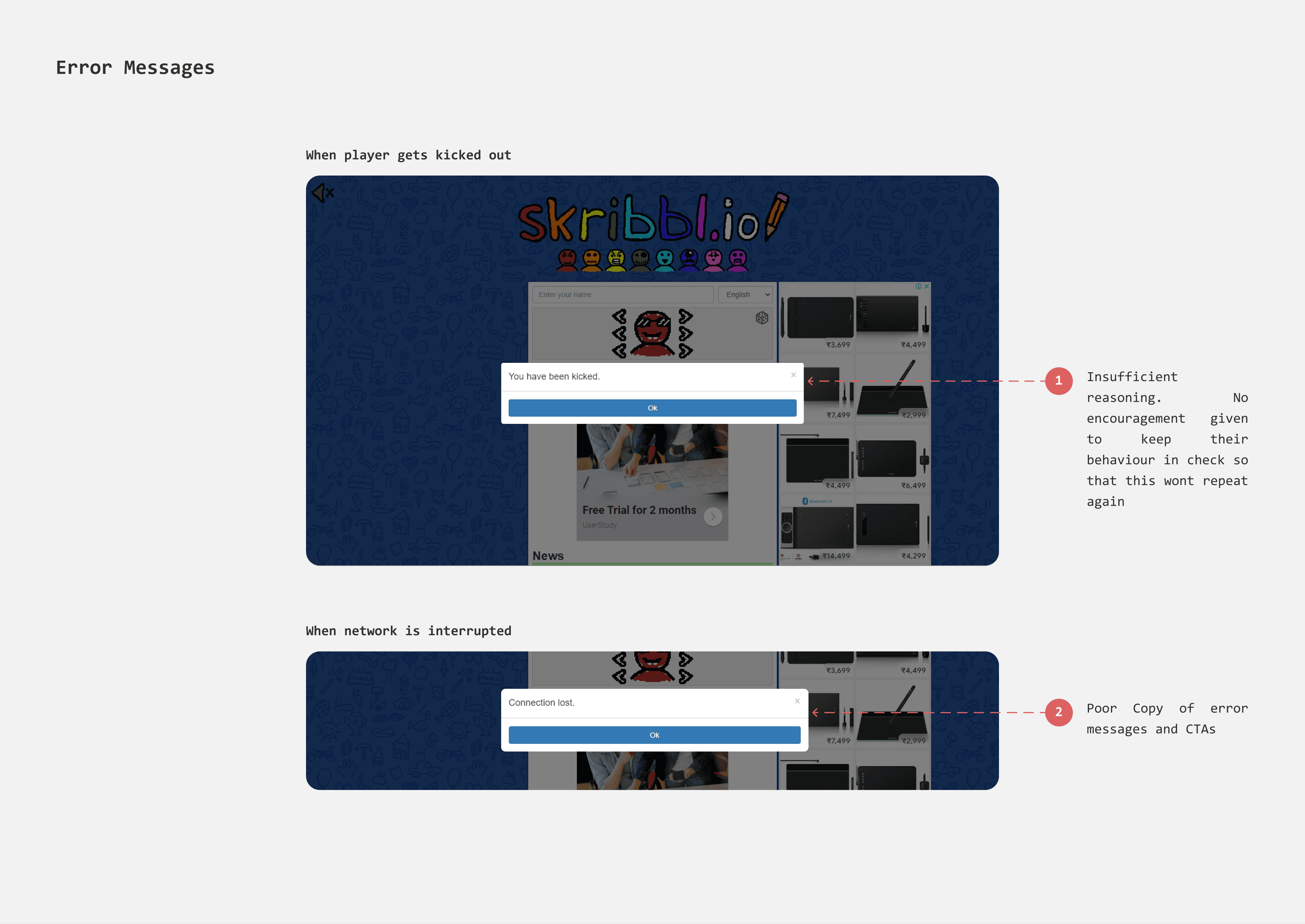
When connection is lost
When network interruptions occur, the "Connection Lost" dialog has an "Ok" button which feels cold and robotic.
I introduced illustration a concise explanation to make the message visually engaging and easier to understand. To keep users invested in gameplay despite the interruption, I included a "Try Again" button.
Existing
Redesign
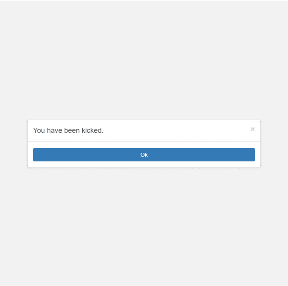
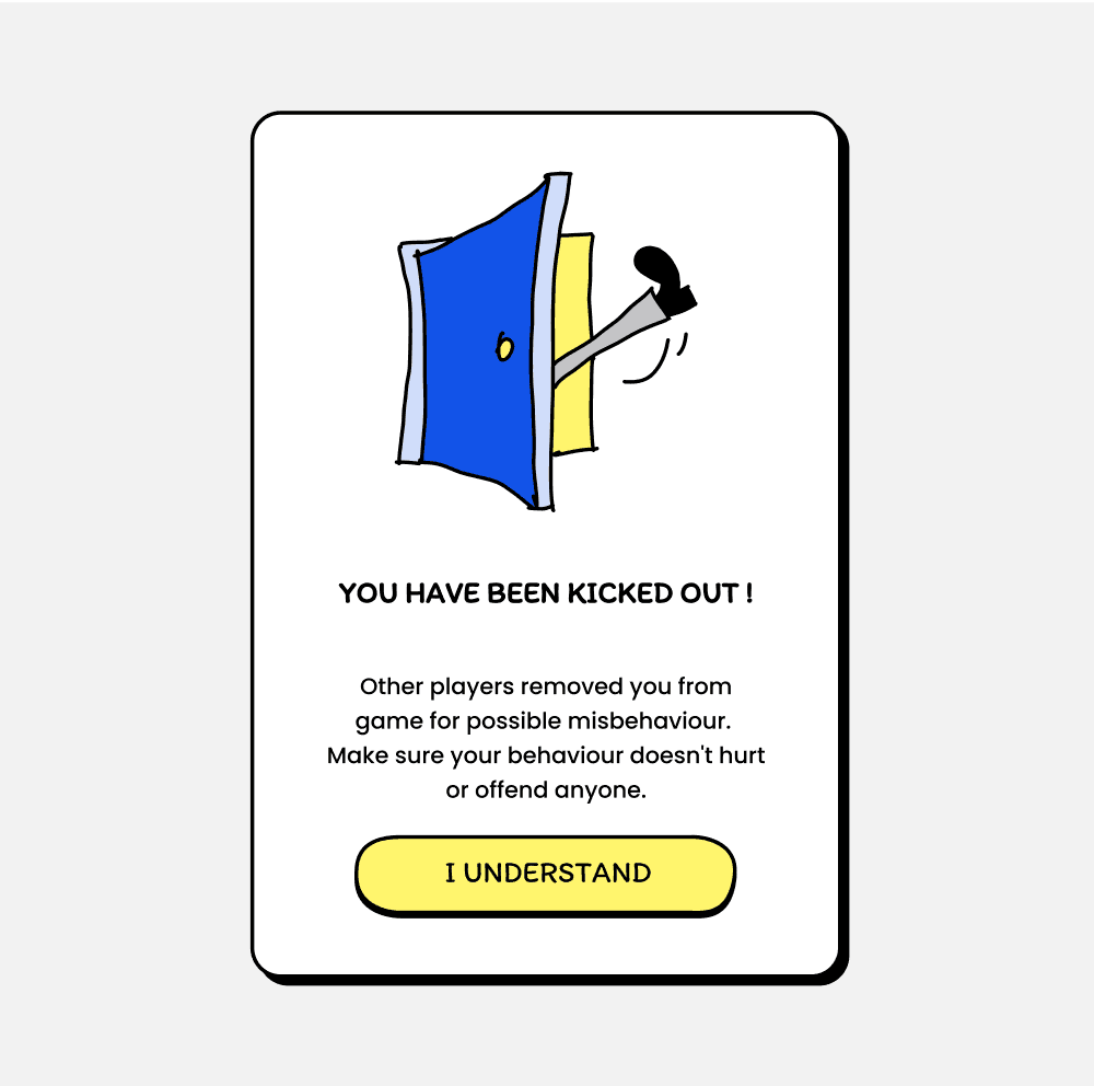
When a player is kicked out
During the game, players can vote to kick out a misbehaving player. When enough votes are cast, the player is removed and shown a dialog box. Previously, this dialog only stated "You have been kicked out" without explaining why or addressing their behaviour.
I redesigned the dialog box to clearly outline the consequences of bad behaviour and included an acknowledgment button labelled "I Understand" to encourage the good play.
Existing
Redesign
FIGMA FILE
Existing Designs, New Designs, Components etc
Ctrl+Scroll to Zoom in & out. The file might take a while to load.
TAKEAWAYS
Scribbl is my first personal UX project, and also my first time working on Game UI. I referred to multiple Game UI case studies to understand what makes a good game interface.
It was challenging and fun to design icons, buttons, and logo and make them jitter. I was fascinated by prototyping. I learned auto layout. I enjoyed making illustrations and doodles, dedicating three days to creating the doodle background. Most importantly, I learned the importance of userflows.