LOCK THE BOX
Helping book lovers buy multiple books within 3hrs
How I redesigned the shopping experience of an online book store that has timed cart and where books are purchased by filling a certain box.
Overview
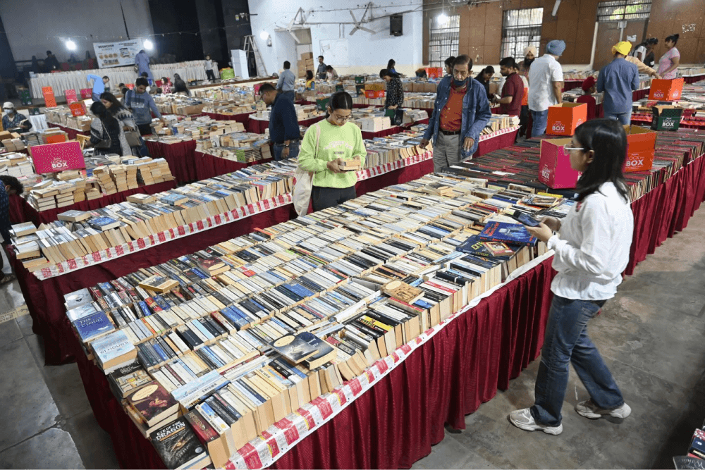
Lock the box started in 2017, as an offline event conducted by bookchor, which sells second hand books. And in 2020, Lock the box launched its online bookstore.
While the offline events manage to sell more than 4 lakh books in a city, the online platform struggles to meet people’s expectations. The reason for this shortcoming is their compromised collection and the overall user experience of online site.
In this case study, I will be dissecting each problem and come up with solutions that can significantly enhance the book shopping experience.
Book fairs by Lock the Box
THE CONTEXT
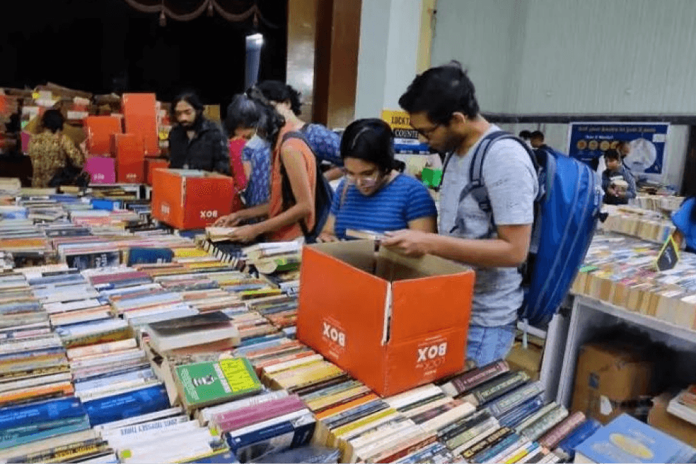
How Lock the Box works?
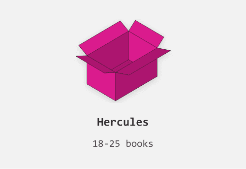
3 boxes to fill
As the name suggests, the "Lock the Box" concept allows people to buy books by filling a designated box. There are three different box sizes to choose from, and customers can add as many books as will fit while keeping the box closed flat. Once the box is filled, it is sealed, thereby "locking" the box.
Smallest Box
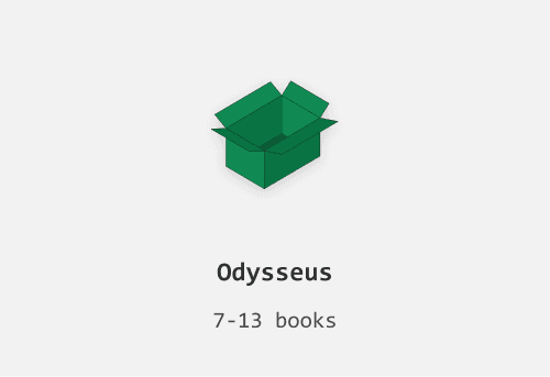
Medium Box
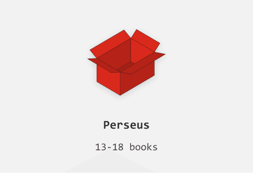
Largest Box
A 3 hour window
“Lock the box” allows people to shortlist certain books before adding them to the box. And these shortlisted books shall disappear after 3 hours. The timer is triggered once the user adds a book to shortlist. User is expected to fill the chosen box and checkout before they run out of time.
THE CHALLENGE
How might we help users to choose and fill the box with multiple books rapidly without getting overwhelmed?
The Goals
Discovery
Improve discoverability and search experience
Consideration
Enhance product viewing experience
Decision
Make product value apparent
Purchase
Streamline checkout flow
EXPLORATIONS
Multiple iterations
VISUALS
UI Elements
Bringing consistency
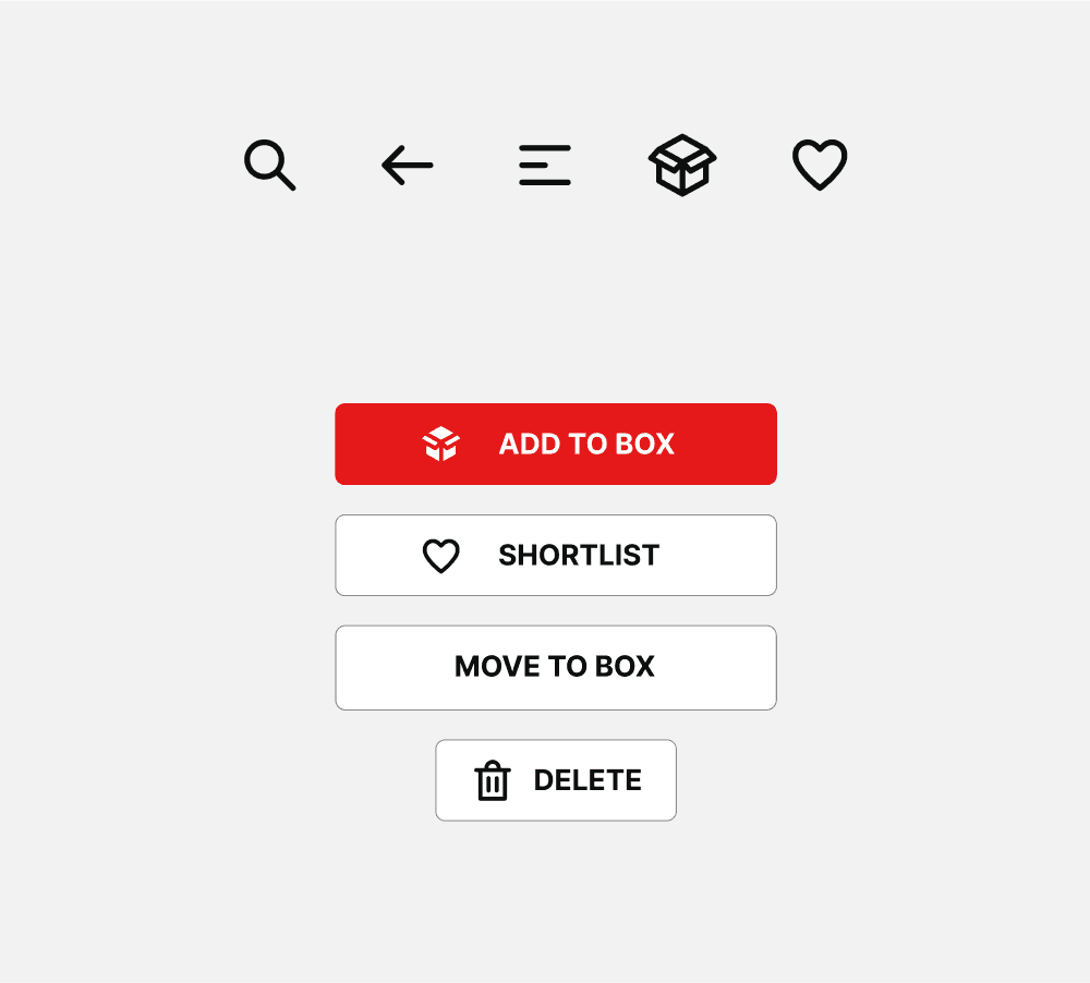
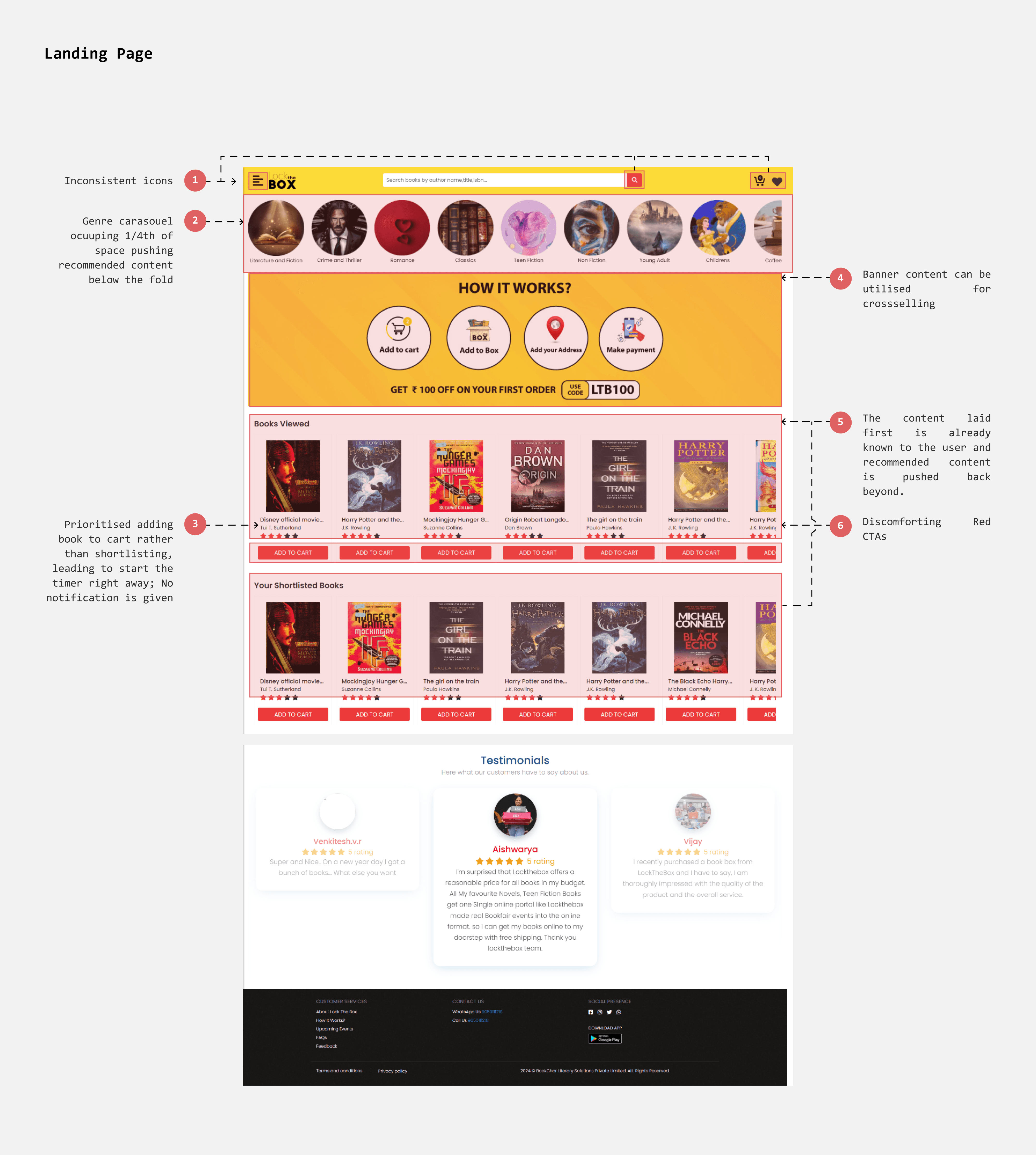
The icons are inconsistent with varied line widths , sizes and fills. I designed a set of icons that opt for simple stroke with round edges.
The inconsistencies can be seen in buttons as well, with too many different sizes and color. While adhering to the basic style of buttons i kept buttons simple yet familiar.
Existing
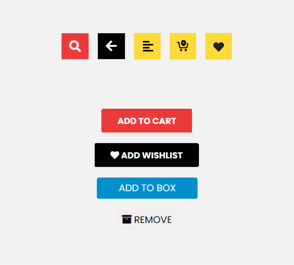
Redesign
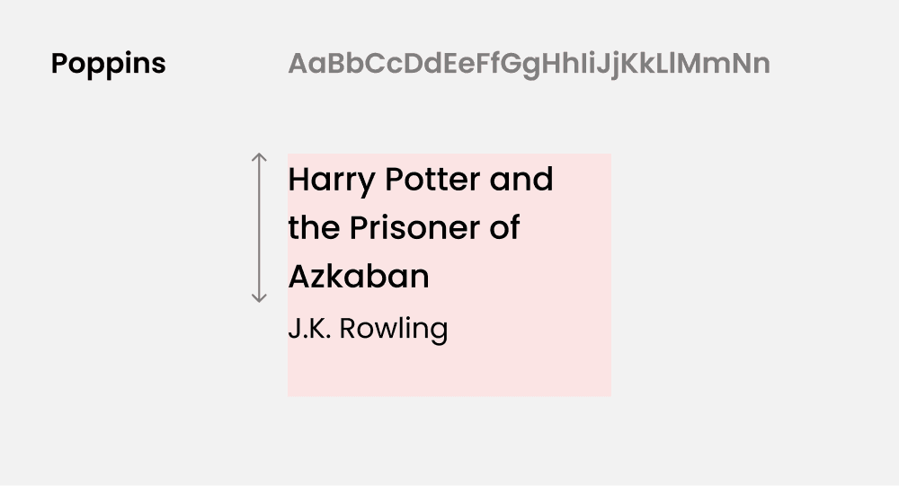
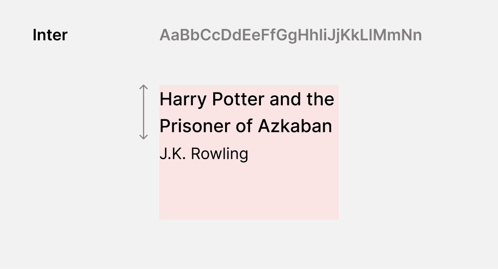
Change of Font
The site currently uses Poppins as its typeface, which is legible but can appear wide. Given that book titles can be lengthy, it's important to maximize text visibility within fewer lines. So, I opted to replace Poppins with Inter, a leaner typeface that allows more text to fit on a single line.
Existing
Redesign
Book Cards
Designing according to the context
One of the most challenging elements to design was the product card. The book card needed to be a dynamic element, capable of fitting seamlessly into different scenarios.
On landing page
On the landing page, where best picks and popular titles reside, providing just the book title and author name is sufficient to establish context and facilitate quick decision-making.
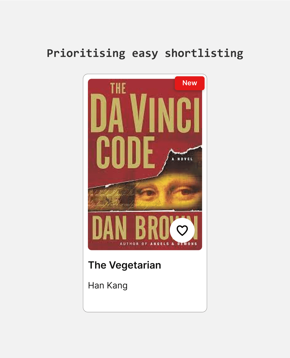
On Product listing page
I chose a horizontal layout that accommodates multiple book details and fits well on mobile. I introduced genre chips for more context and a heart icon for quick shortlisting.
On shortlisted page
The shortlist page is designed to simplify adding books to the box. I made the "Move to Box" button prominent to ensure users can quickly and effortlessly add their selected books.
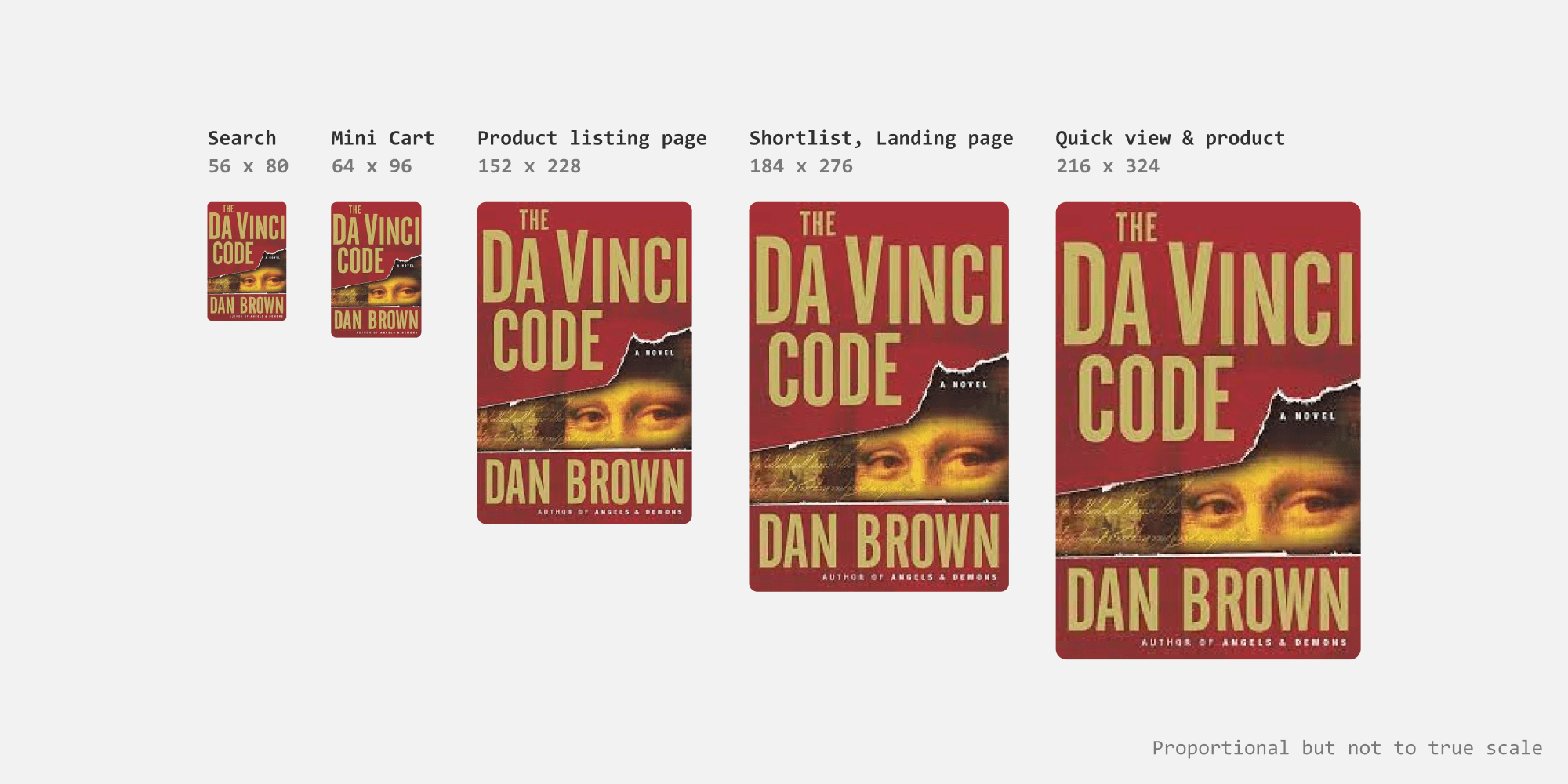
Book Covers
Scaling proportionally
For book cover thumbnails, I set the aspect ratio to 1:1.5 to accommodate various book sizes without distortion or cropping important content. Thumbnails are larger on the category, shortlisting, and landing pages, where book covers greatly influence user actions. For the search bar, thumbnails are smaller but still provide sufficient context.
Book thumbnail sizes
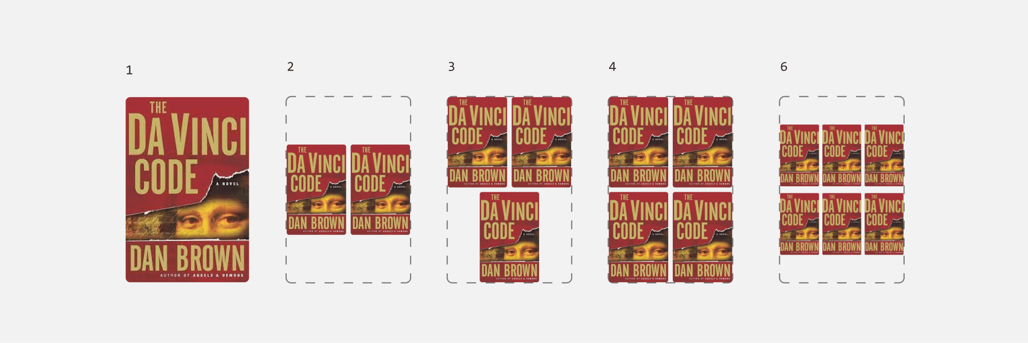
Designing for collections
The book collections can be represented by having multiple cover thumbanils arranged in usual book thumbnail space. I started the layout with 2 and designed till 6 books.
Book Collections
The flows
Adding book to Box
Current flow - Misleading “Add to cart” CTA
When a user clicks on “Add to Cart” the book appears in minicart under “shortlisted books”. This means minicart acts as an interface to “shortlisted books”, which can be added to box further by clicking “Add to Box”.
This makes the "Add to Cart" CTA misleading, as it implies that books are added to the box directly without extra steps.
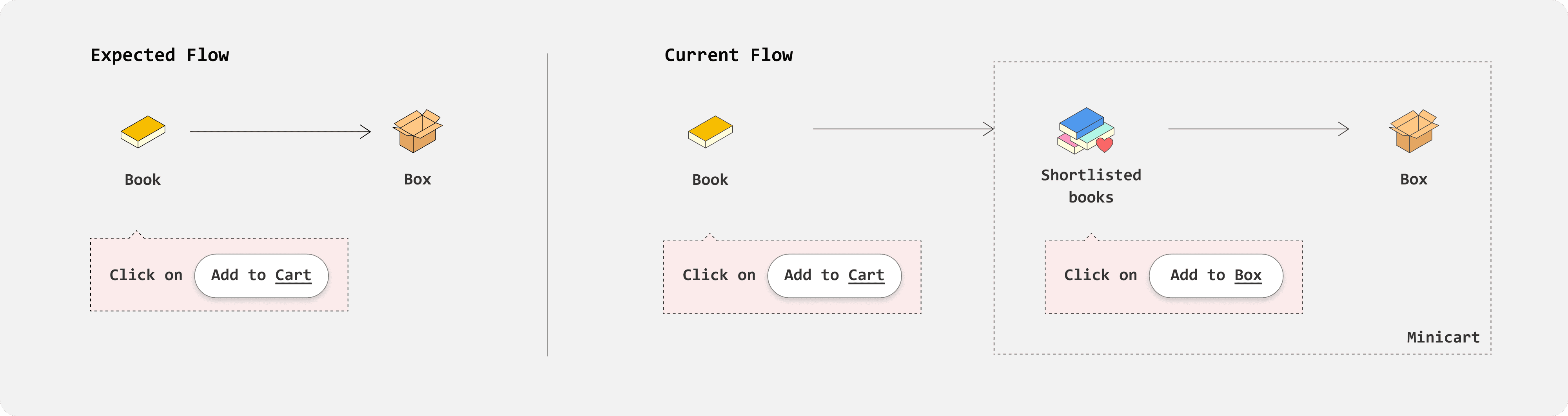
Redesigned flow - Simplified one step process
I replaced the "Add to Cart" option with "Add to Box," allowing users to add books directly to their box instead of a shortlist. The minicart now represents the box and the books added to it. This simplifies the process of adding books to the cart
Redesigned Flow
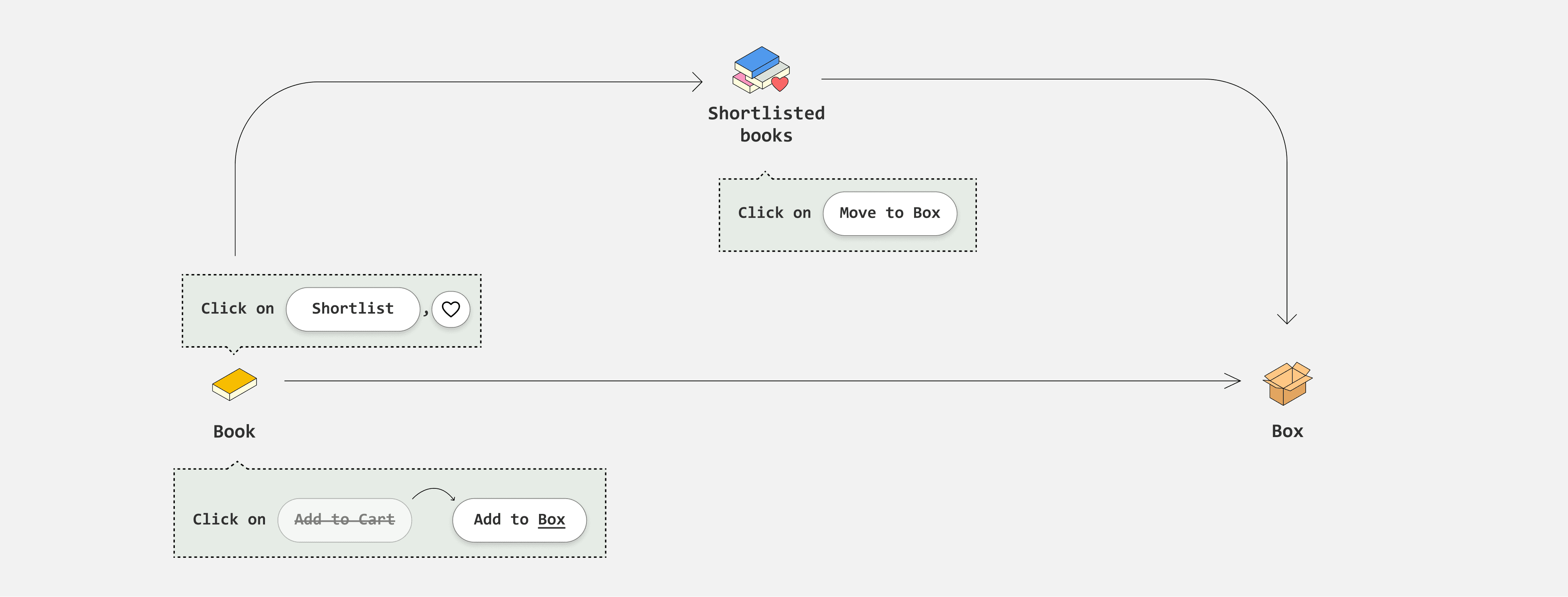
Wishlisting flow
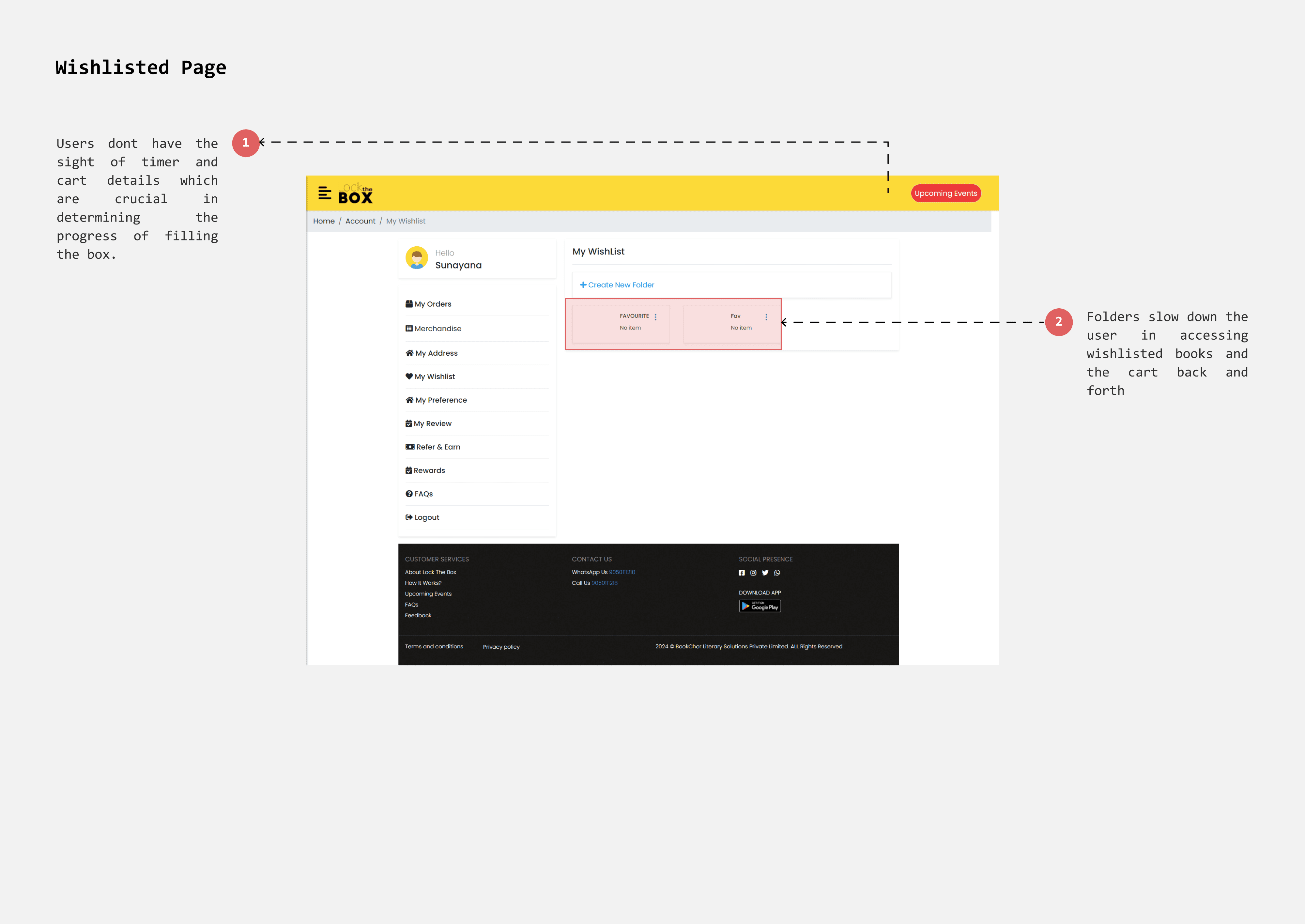
Current flow - Tedious process
Currently wishlisted page has folders to allow users to categorise their favourite picks. However, It is tedious to access wishlisted books since users must open each folder. Users go back and forth frequently between favourite picks and box(cart) to optimize books selection.
Redesigned interface
To address this, I implemented a "Shortlist" page that functions like a favourites or Wishlisted page. Users can save and organize their preferred books for future consideration.
How should Cart(box) and Favourites (Shortlist) work?
A book can either be in the shortlist or in the box, but not both. This approach simplifies book management and ensures clarity, as the same book won't appear in multiple places.
Given that a box can hold up to 25 books, users can shortlist more than 30 books or even more and by keeping books exclusively in either the shortlist or the box, users can easily recognize and track their selections.
REDESIGNS
Landing Page
side menu
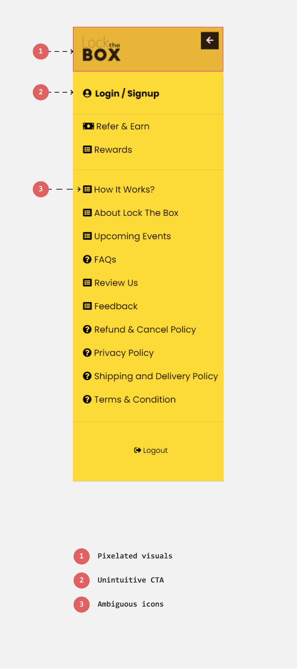
Easy finding options with categorization
The icons beside the options are repeated, failing to accurately represent each option. Additionally, some commonly accessed options, such as recent orders, notifications, and settings, are missing.
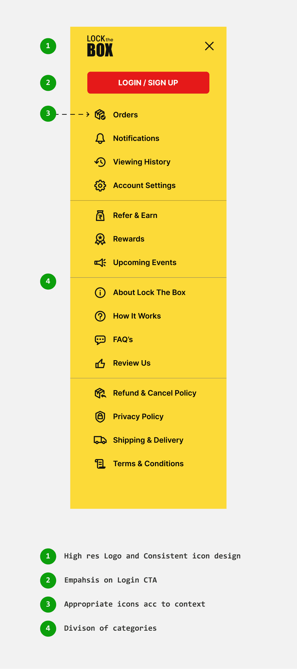
I designed distinct icons for each option to help users identify their choices at a glance. And categorized the options to enhance classification.
Existing
Redesign
Genres & Suggestions
Introducing niche genres to enchance discoverability
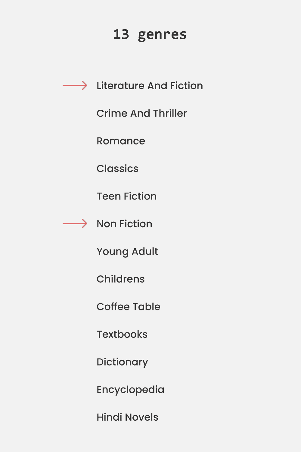
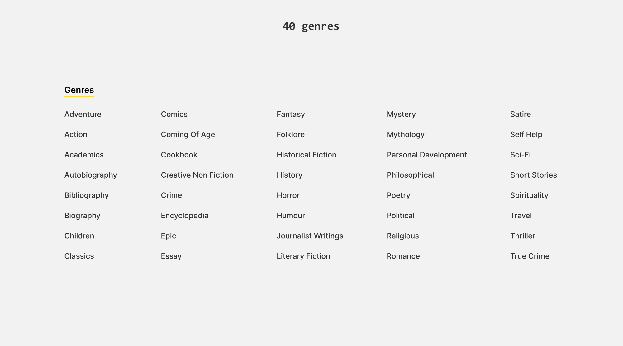
Currently there are 13 genres, which can be further divided into niche categories. For instance, fiction alone can be divided into 25 niche genres. Choosing books from the general ‘fiction’ category can yield vague results, making it challenging for users to find books that match their specific interests.
I expanded the 13 genres into 40 niche categories to better cater to a broader audience with diverse interests and assist users in finding books within specific genres.
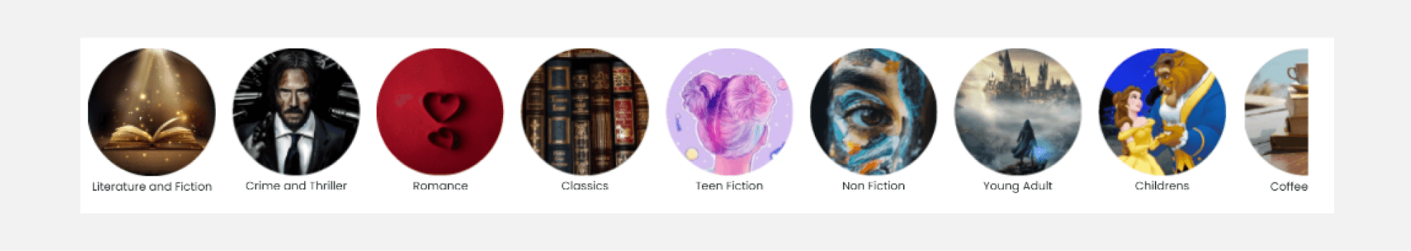
Replacing genre carosouel with suggestion tags
The genre carousel currently occupies 1/4th of the space above the fold, pushing relevant content and suggestions below. To address this, I replaced the genre carousel with suggestion tags, which take up less space. Additionally, these tags help users find the best books across different genres while keeping the page layout more streamlined.
Existing
Redesign
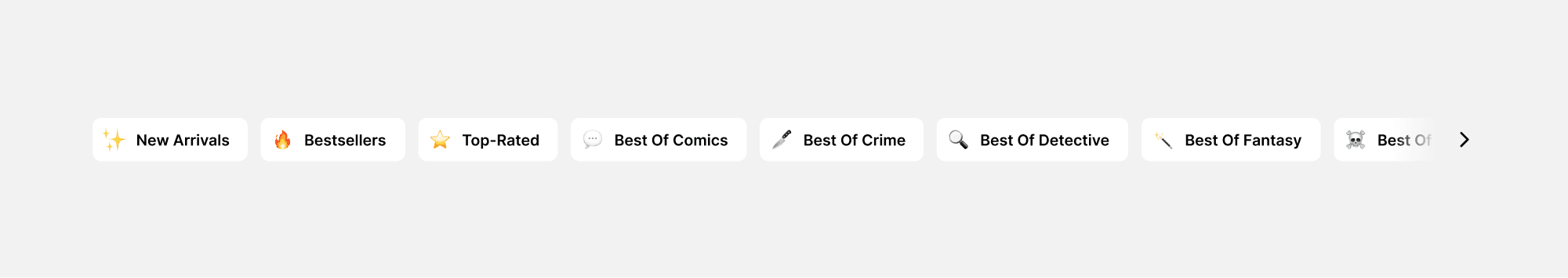
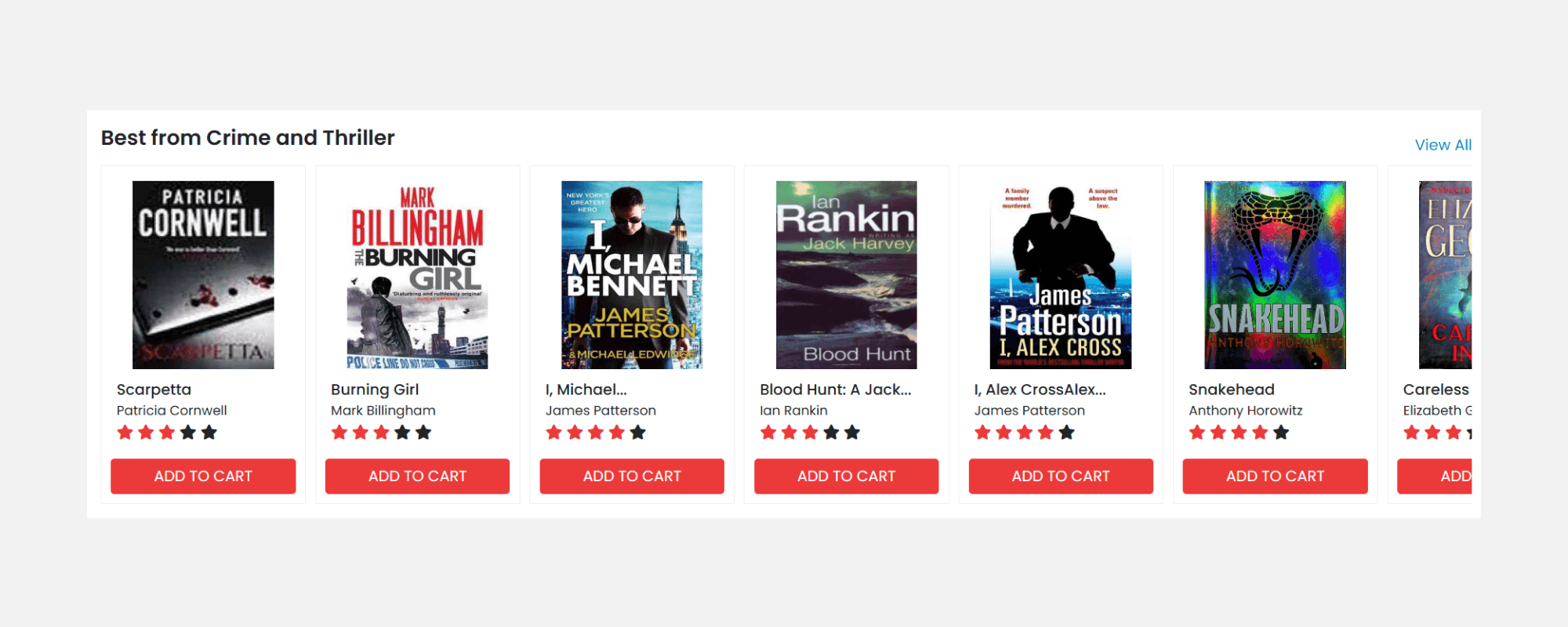
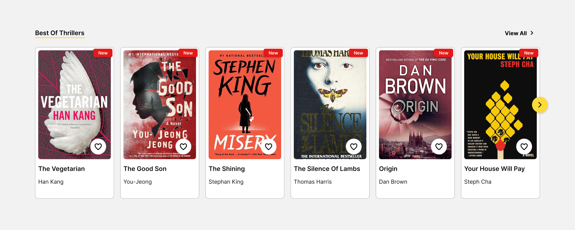
Recommendations
Pushing shortlisting via best picks
The book cards currently feature an 'Add to Box' CTA in bright red, which is repeated throughout the page and can be visually overwhelming. Also, adding a book to the cart triggers the timer. The best approach would be to allow users to shortlist books rather add book to box, so that users get time to browse more choices.
Redesign
Redesign
Search bar
Search that supports multiple queries
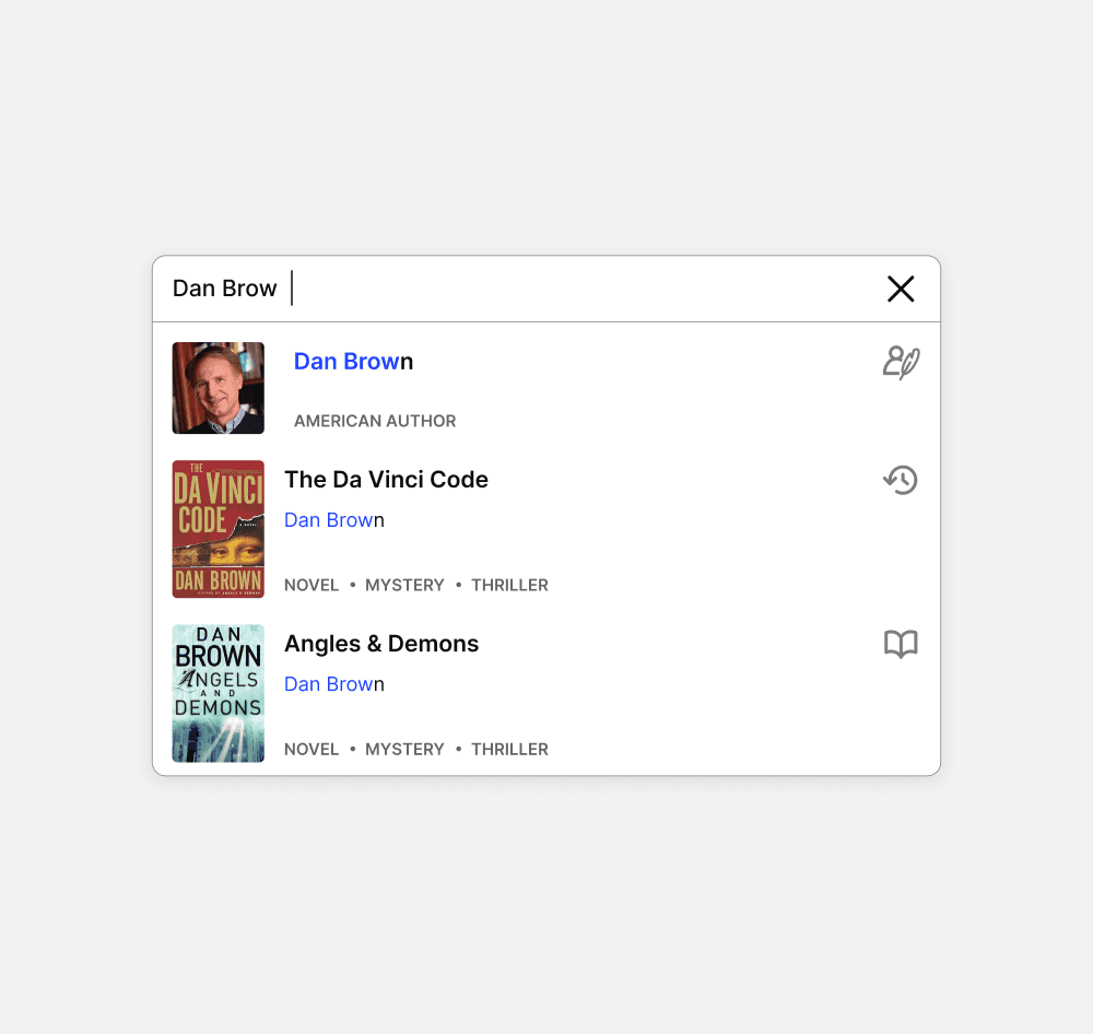
The search bar was intended to provide results for author names, titles, and ISBNs. However, it failed to retrieve results for book titles, which is the most direct and common method users use to search for books.
Enhancing scannability with imagery and icons
To distinguish suggested results, I introduced book thumbnails and icons to indicate whether the result is an author, book title, or genre.
Existing
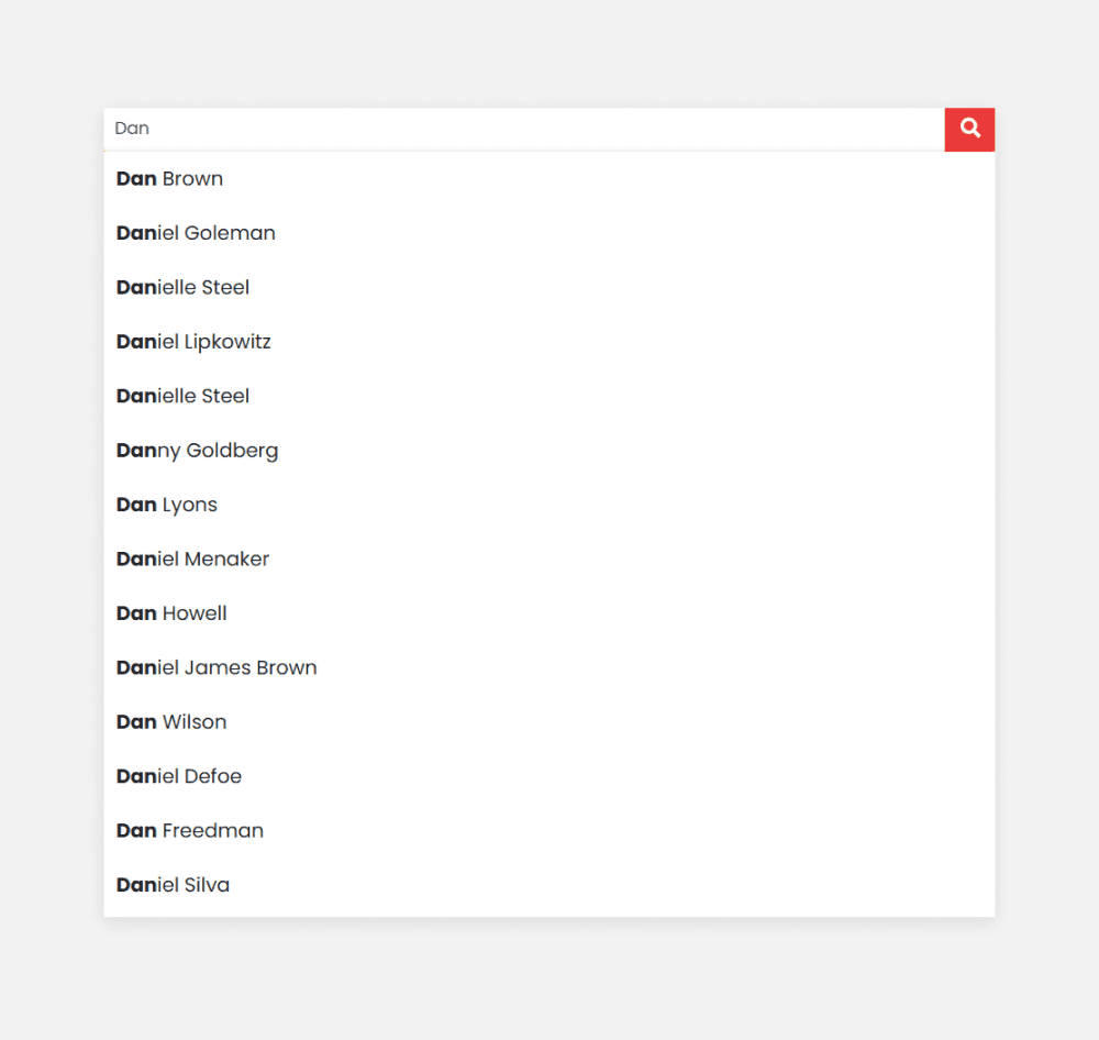
Redesign
Product Listing Page
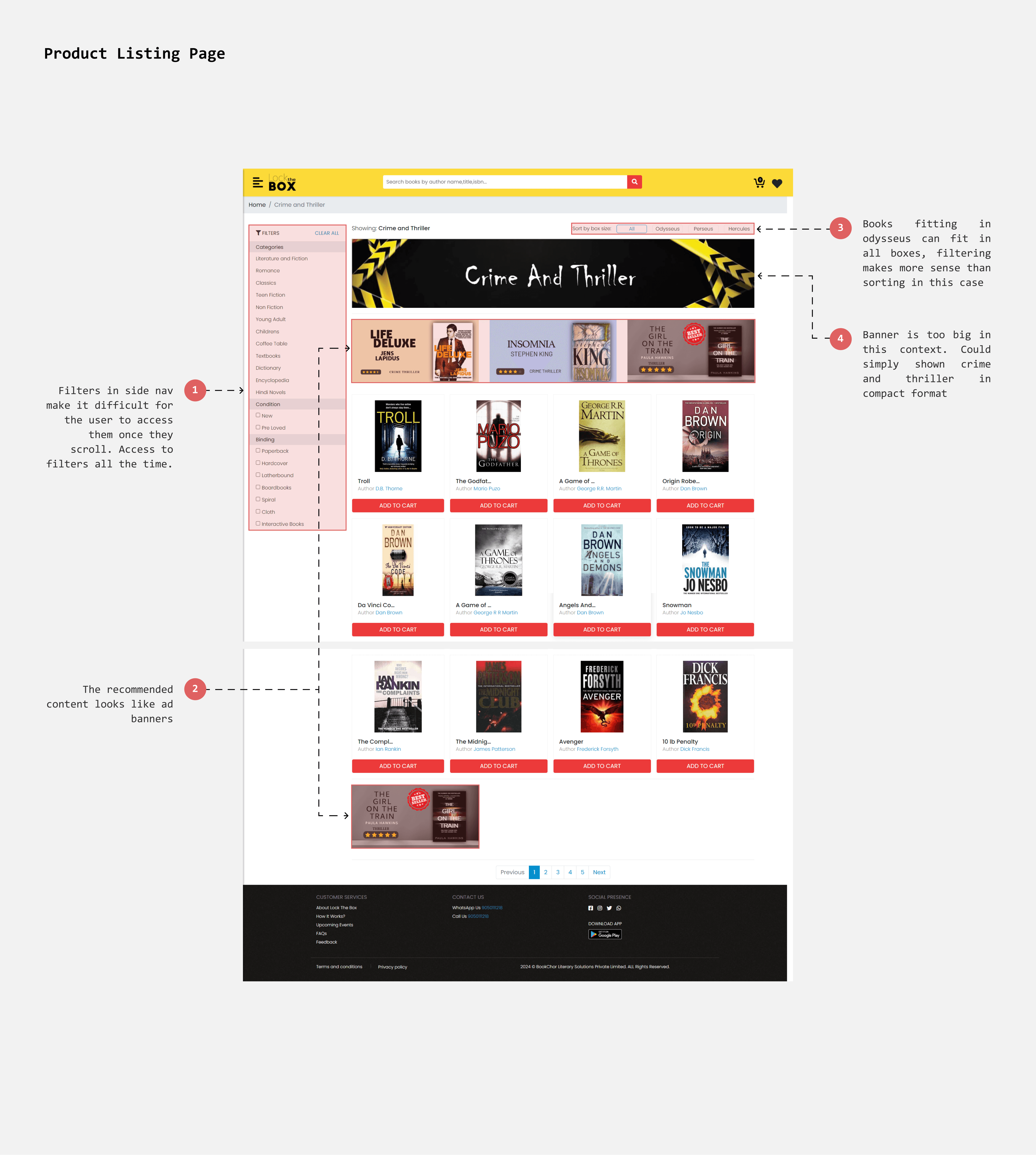
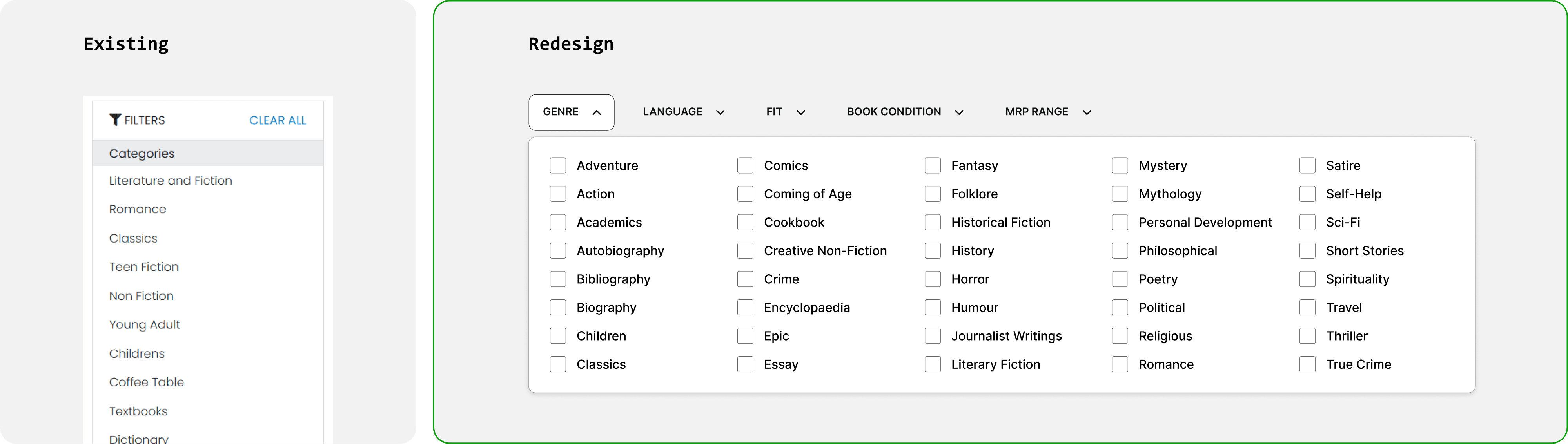
Filters
Making filters accessible
A sidebar filter can be challenging to access when scrolled beyond a certain point. Since time constraints and quick content filtering are crucial, I decided to place the filters in a top bar. This arrangement ensures that all filters are pinned at the top for easy and constant access.
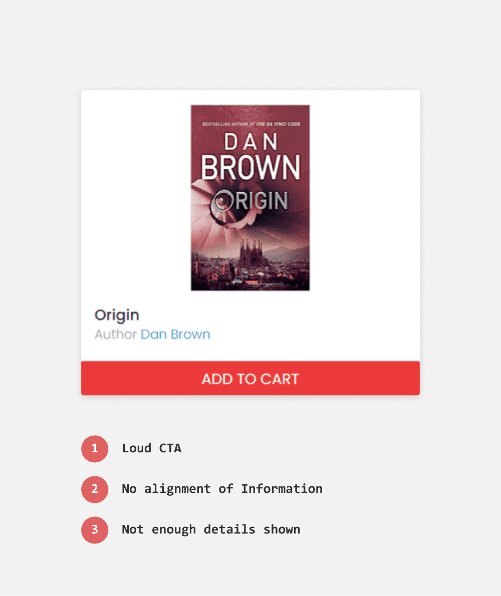
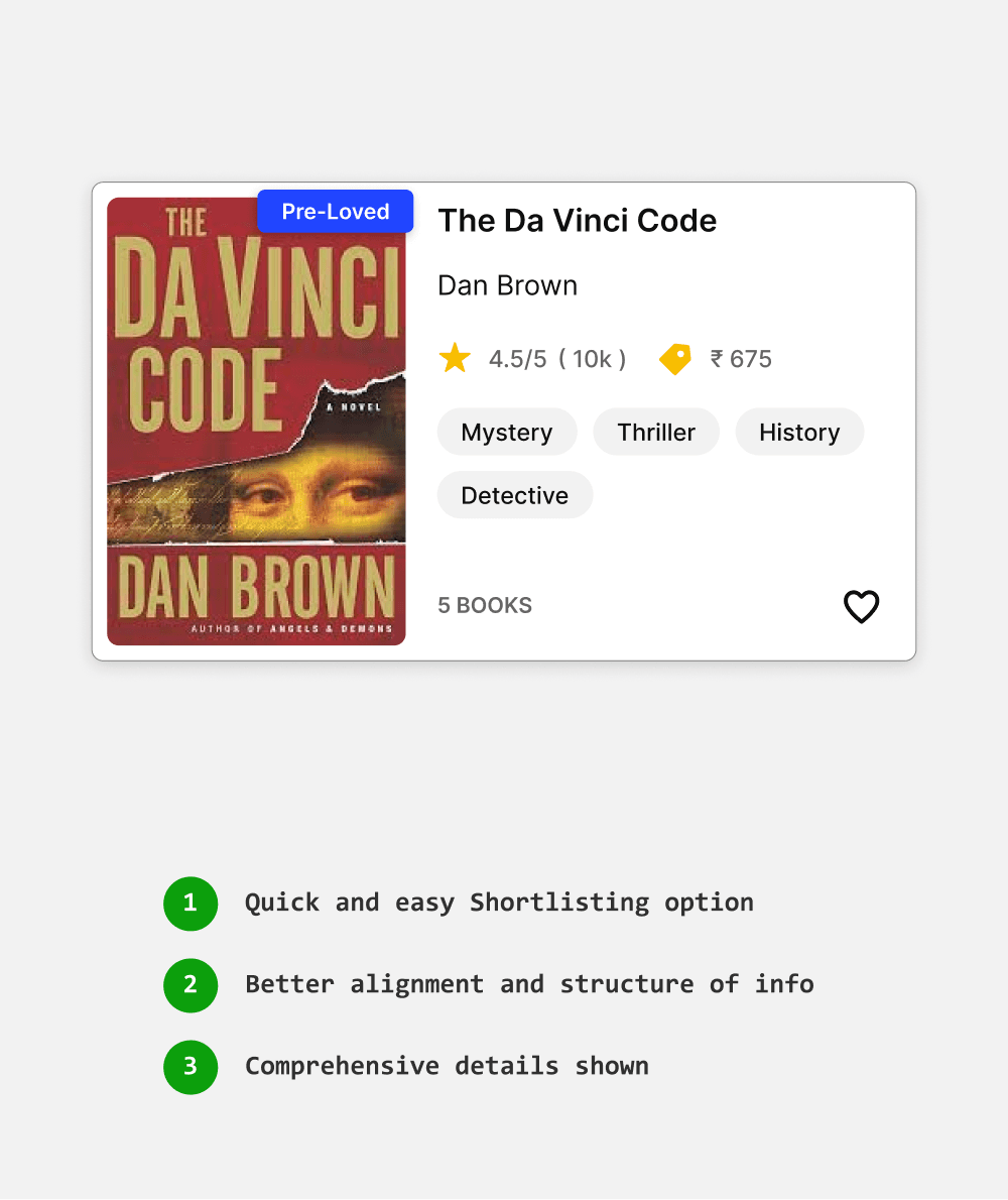
Book Card Design
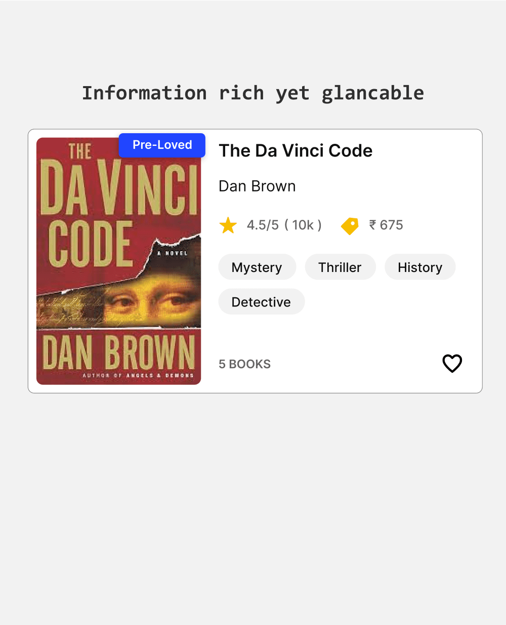
Informative yet glancable
To redesign the book card, I included key factors such as genres, book condition, and MRP to aid users in evaluation and decision-making.
After several iterations, I opted for a horizontal layout. Unlike the vertical layout, which resulted in overly tall cards, the horizontal layout provides space for information next to the book thumbnail, making the cards more compact and easier to glance at.
Existing
Redesign
Search Result
Displaying current query
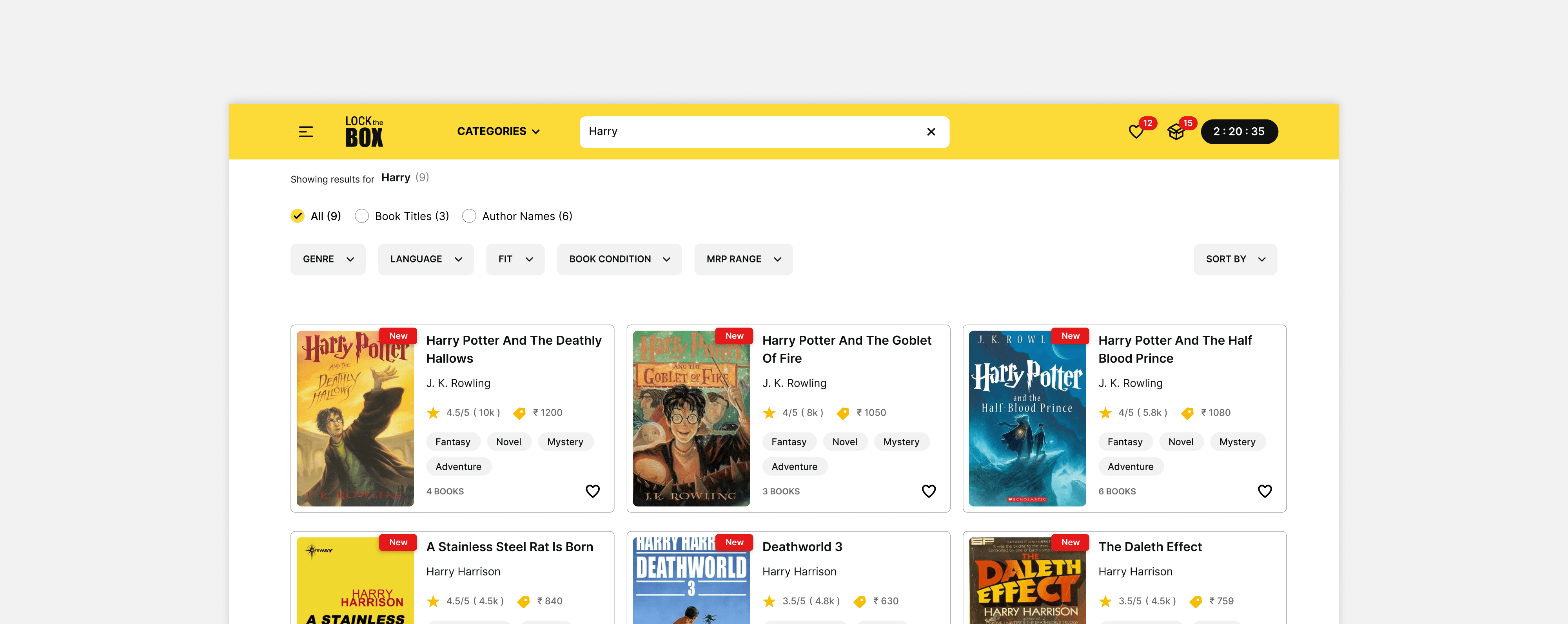
The query in the search box resets to the default placeholder when the results page is displayed. This absence of the current query makes it difficult for users to reformulate their search.
Informing the size of result
Displaying the number of matching results can help communicate the scope of information users need to navigate and maintain the context of their current search.
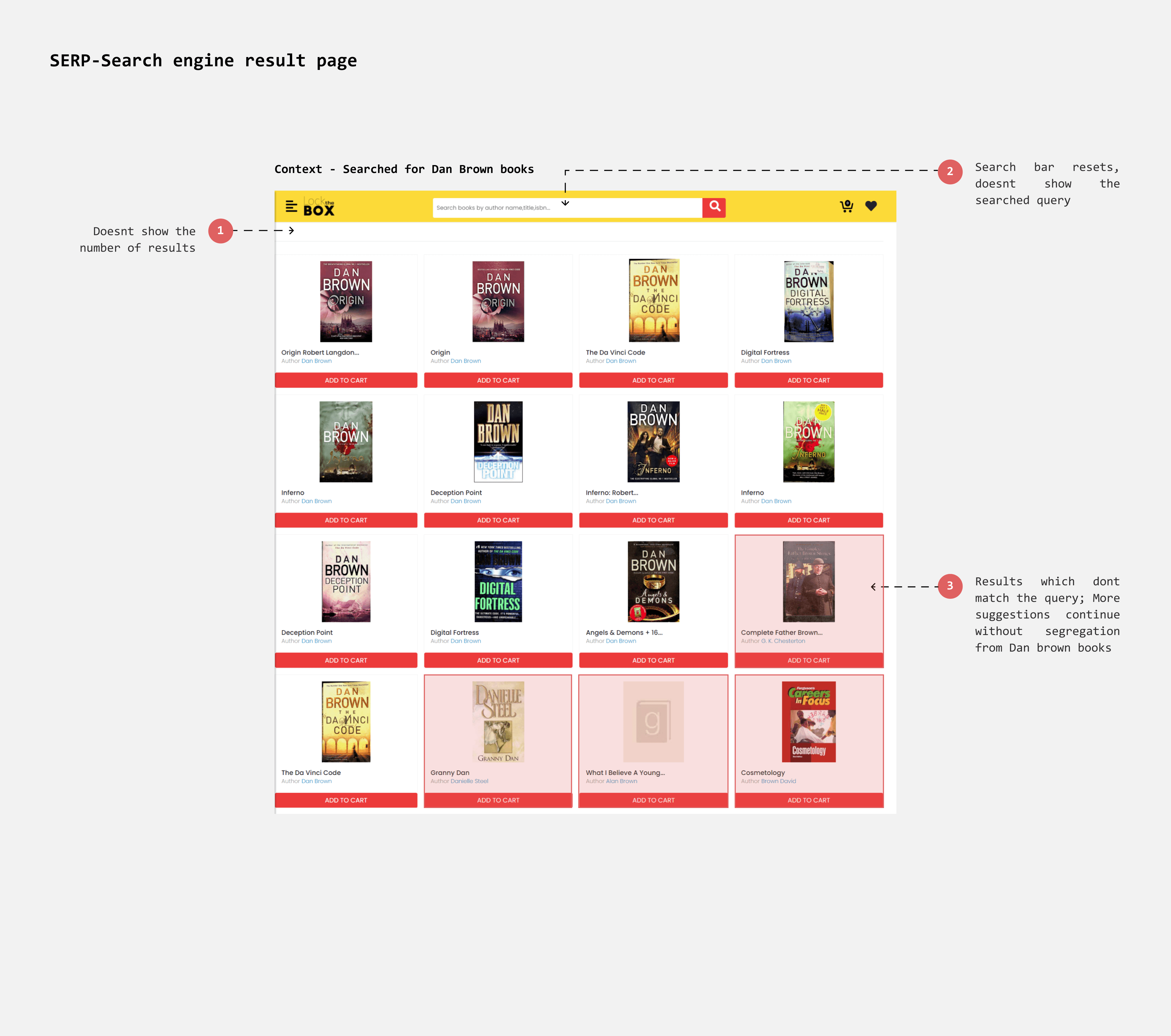
Results page
Adaptable to context
Users can search in three ways: by Genre, Author Name, or Book Title. When searching by Genre, results can be filtered and sorted by factors such as Rating or MRP. When searching by Book Title, the filters adjust based on the number of results.
If the search term matches both an author’s name and a book title (e.g., "Harry"), the results will display books with "Harry" in the title as well as books by authors named "Harry."
Existing - When ‘Harry’ is searched
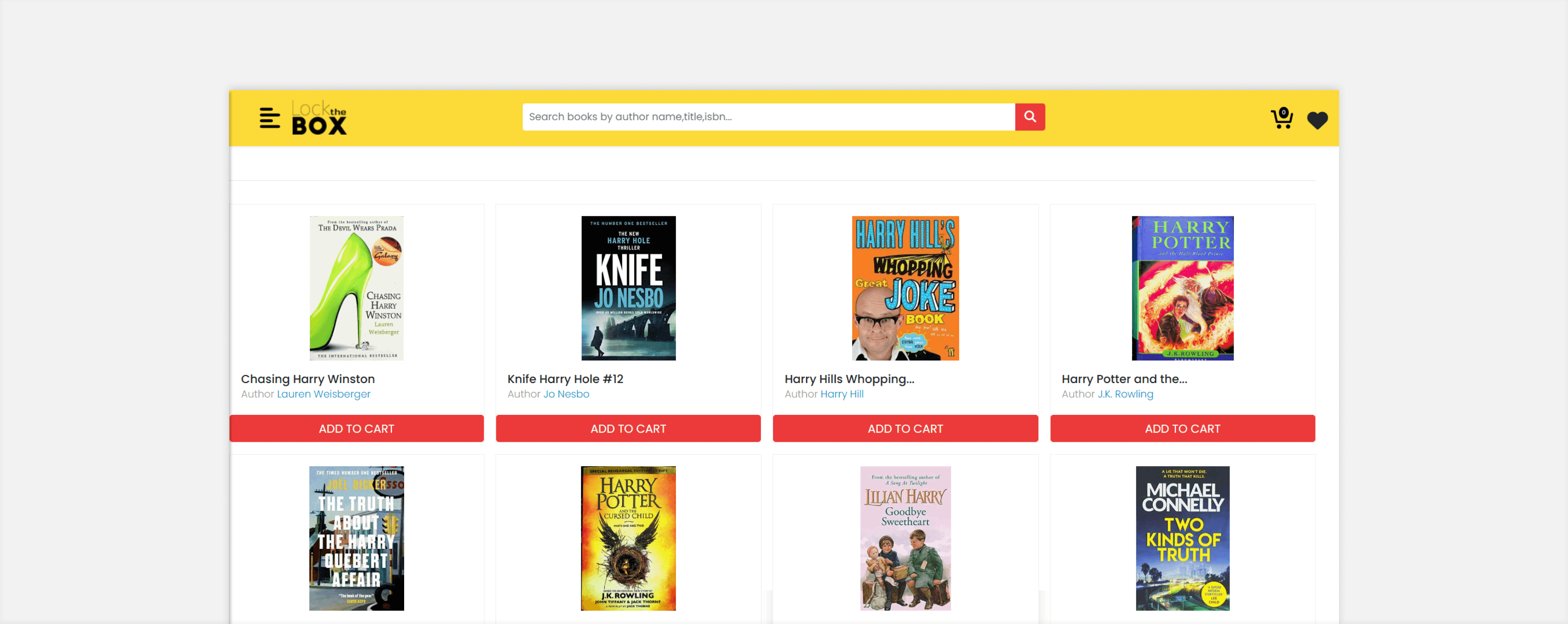
Redesign - When ‘Harry’ is searched
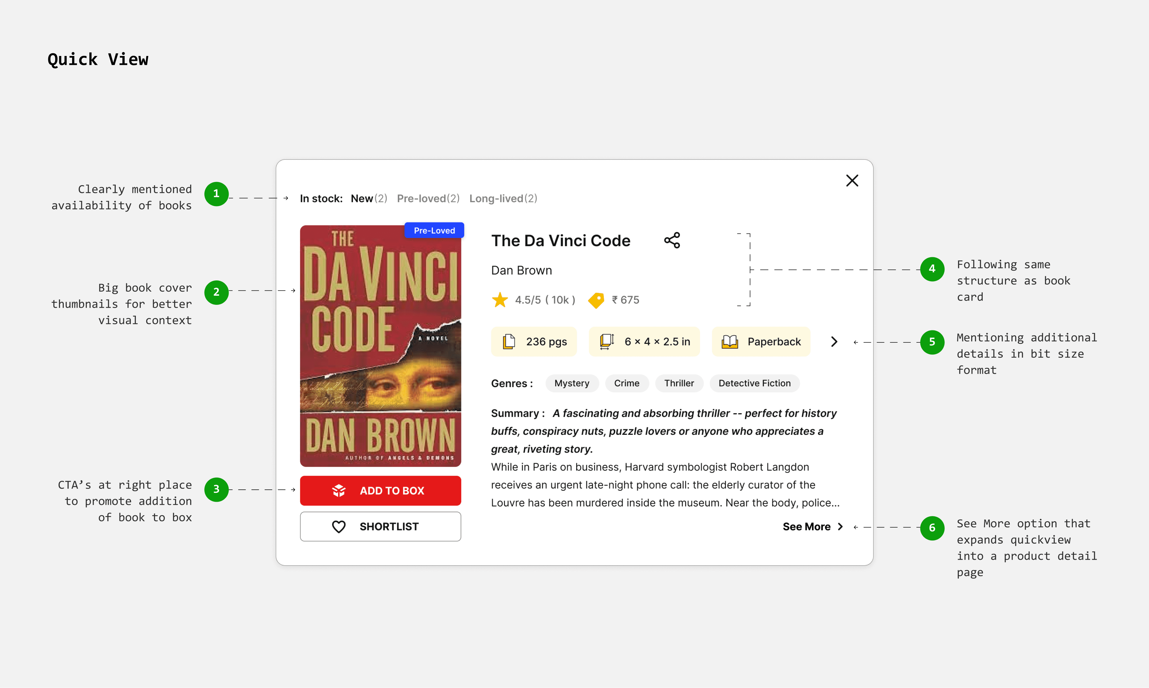
Quick View
Showing more details without leaving the browsing page
In the current flow, clicking on a book card takes users directly to the product page, disrupting their browsing experience.
I’ve introduced a quick view feature, so users can see more details without leaving the browsing page. This reduces friction and helps users make faster decisions.
Product Detail Page
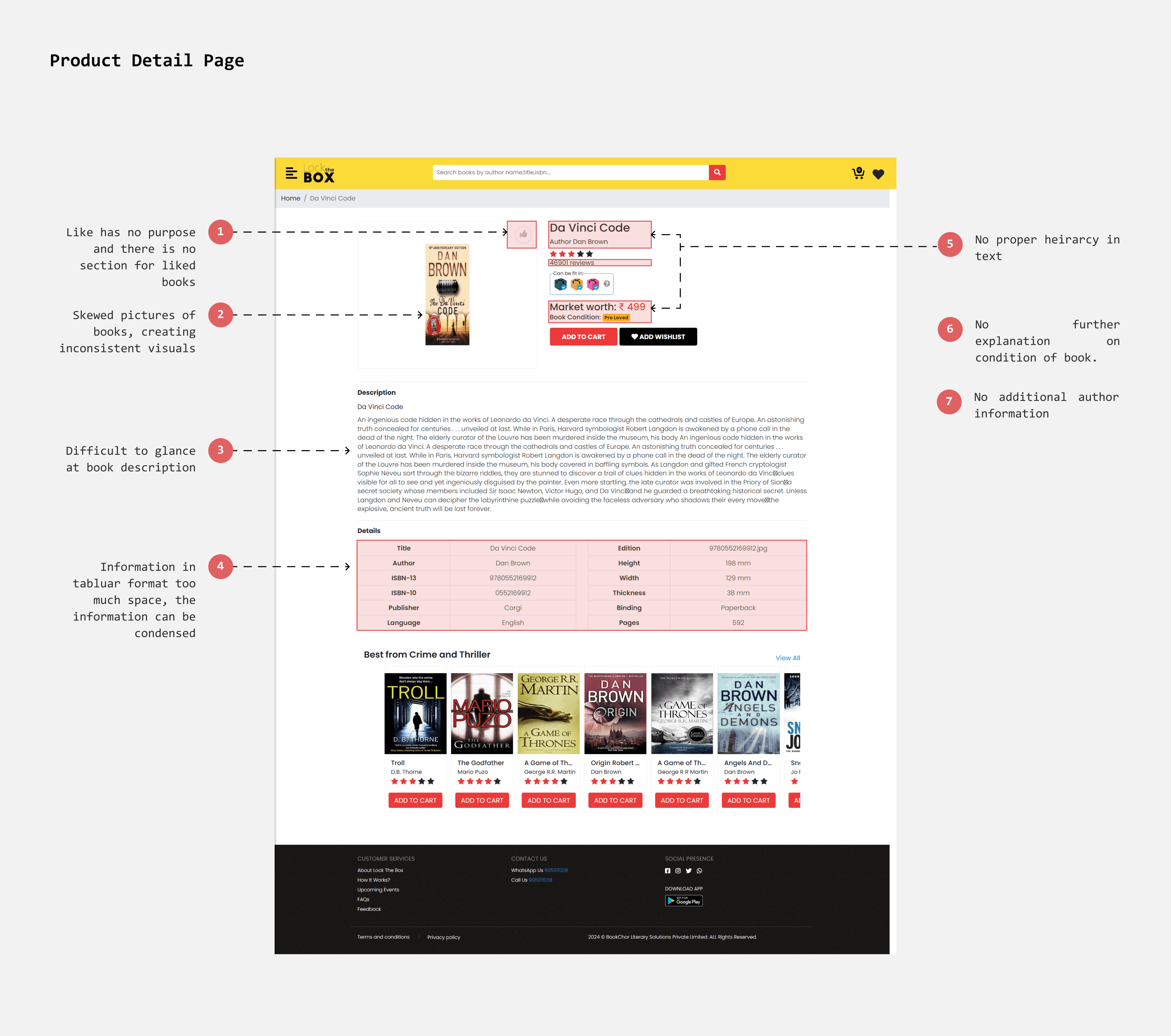
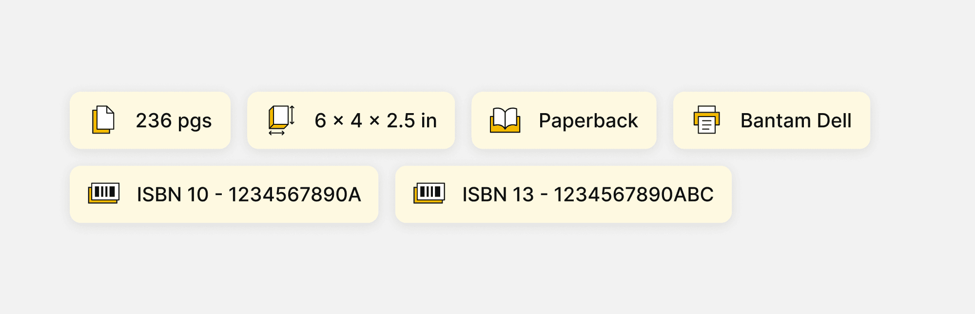
Details
Arranging information in a more compelling format
In the current design, details are presented in a tabular format. Switching to a chip design can save space and enhance glanceability, allowing users to comprehend information more quickly.
Existing
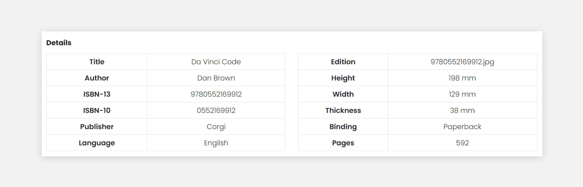
Redesign
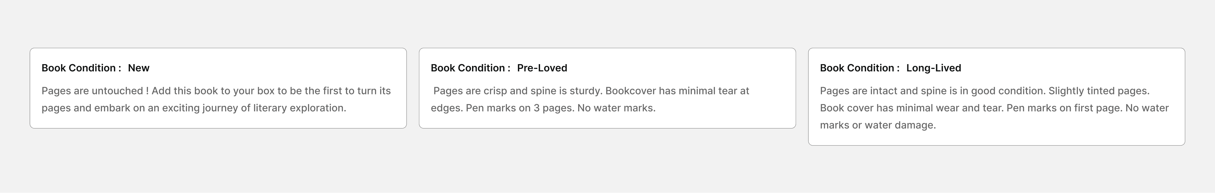
Building trust through book condition descriptions
Describing the condition of each book transparently can build trust and set clear expectations about its quality. This approach encourages users to confidently select pre-loved, well-worn books.
Shortlisted
A single ‘Favourite’ page
As mentioned earlier, wishlisted books can be converted into shortlisted books, allowing users to temporarily store books while they consider their options. I introduced a separate page for shortlisted books, which can be accessed via the navigation bar and the minicart (using the "Add from Shortlist" shortcut).
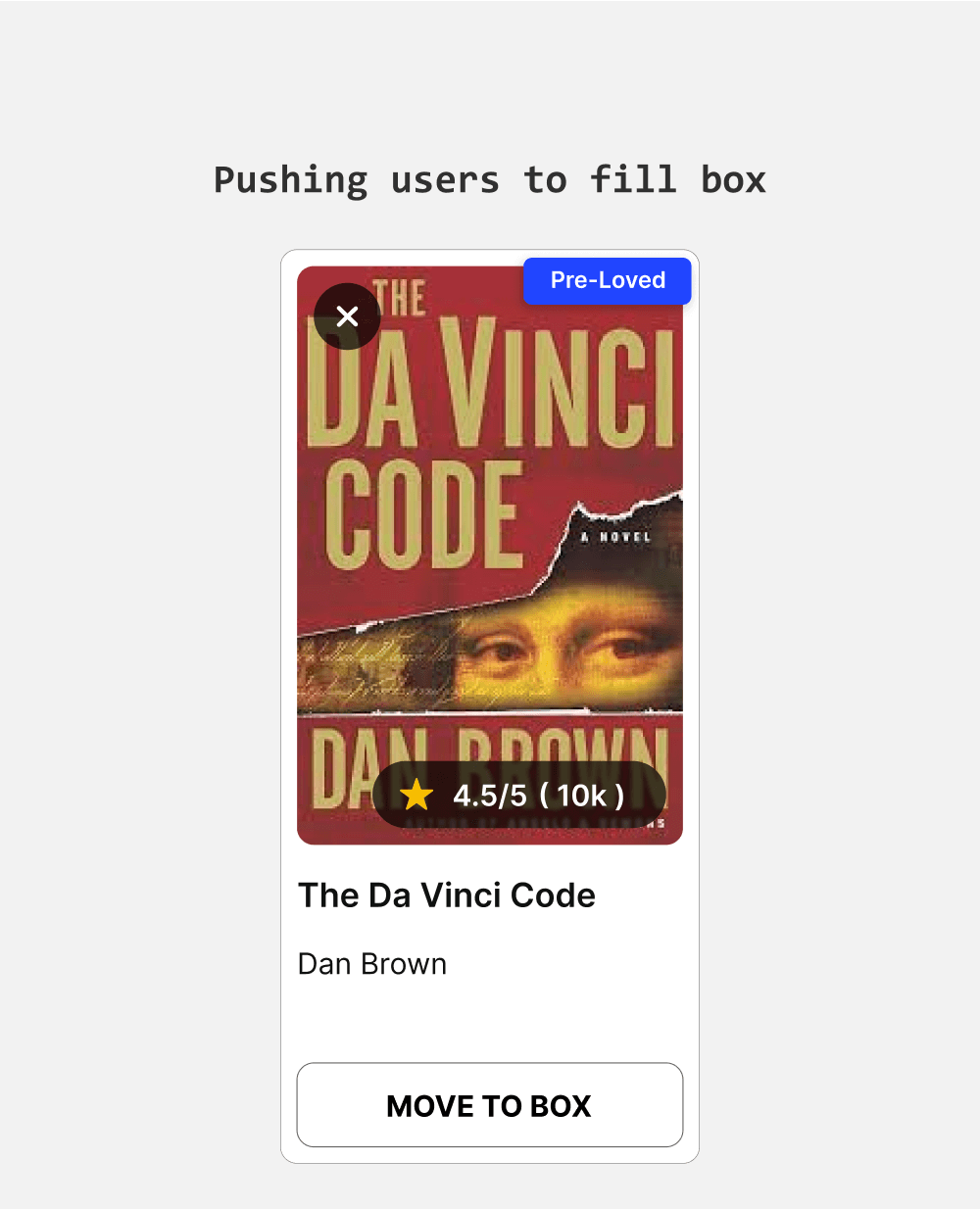
Pushing Actions
The purpose of the shortlist page is to facilitate easy addition of books to the box. I made the "Move to Box" button always visible for faster and more effortless book additions. To simplify comparisons, I included chips displaying ratings, MRP, and size.
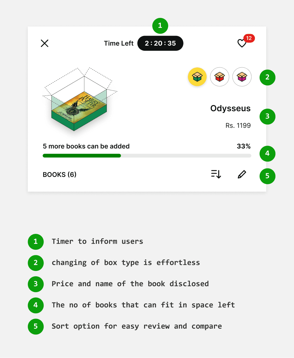
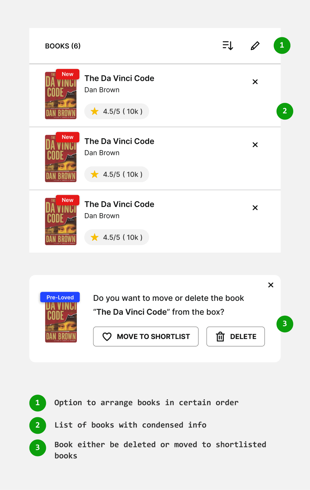
Evaluate better with sorting
When users shortlist 30 or more books for the largest box, providing a sorting option will help them decide which books to eliminate and which to add to the box more easily.
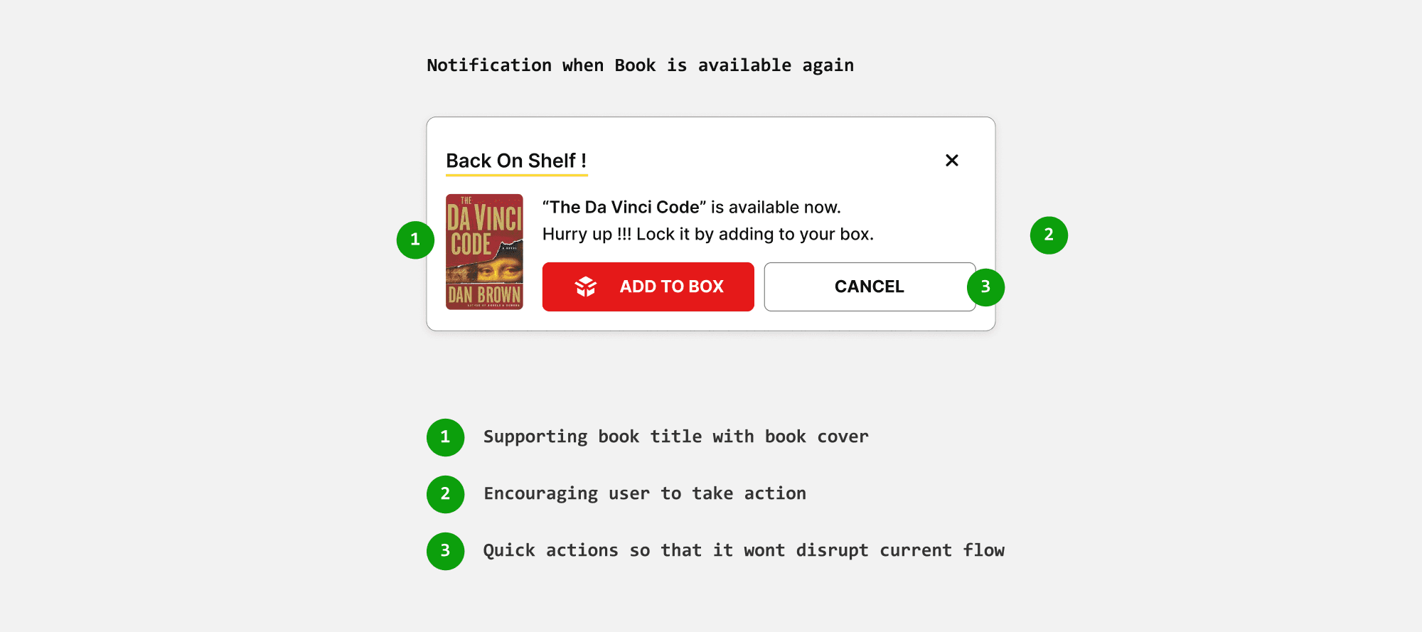
Back on shelf
Books on the shortlisted page may be picked by other users since they aren't locked. If someone else locks these books in their box, they become temporarily unavailable until checkout. If the purchase isn't completed, the books become available again.
To address this, I introduced a "Back on Shelf" notification to alert users when the books are available for purchase once more.
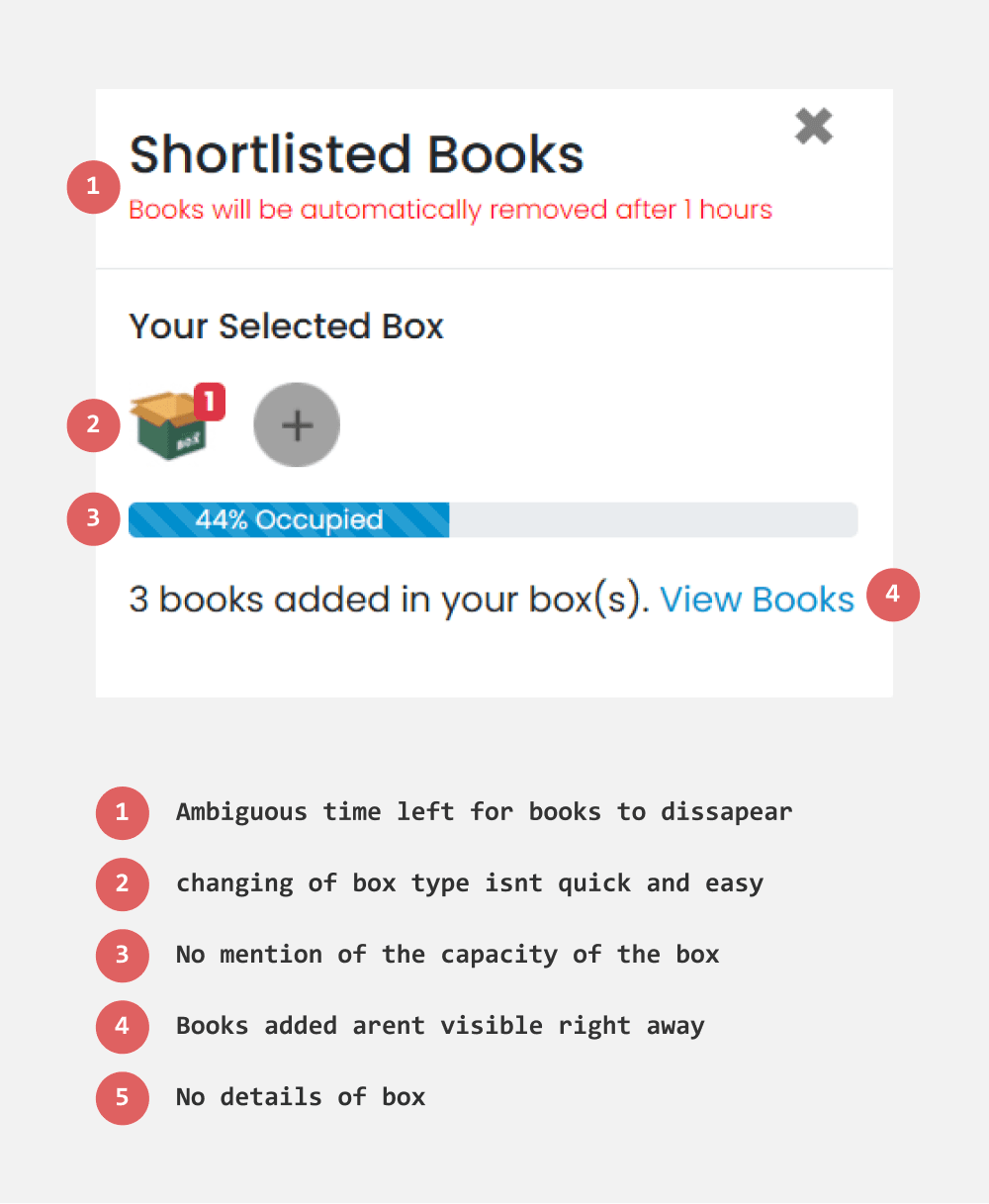
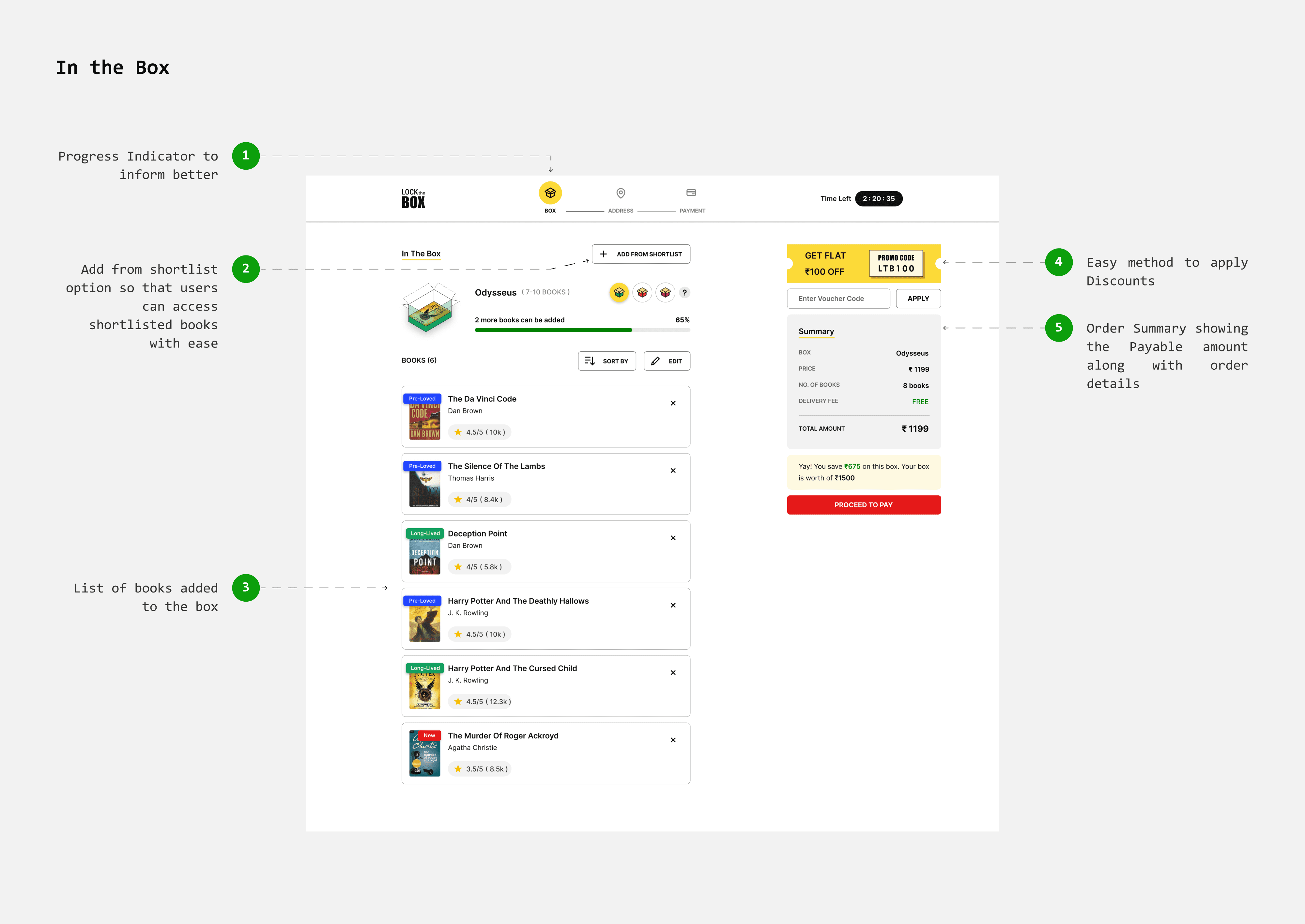
mini-cart
As mentioned in the flows, the minicart serves as an interface for adding shortlisted books to the box. Previously, shortlisted books in the minicart could be added to the box using the “Add to Box” option. In the redesigned flow, however, the minicart now functions as the box itself, listing the added books along with box information.
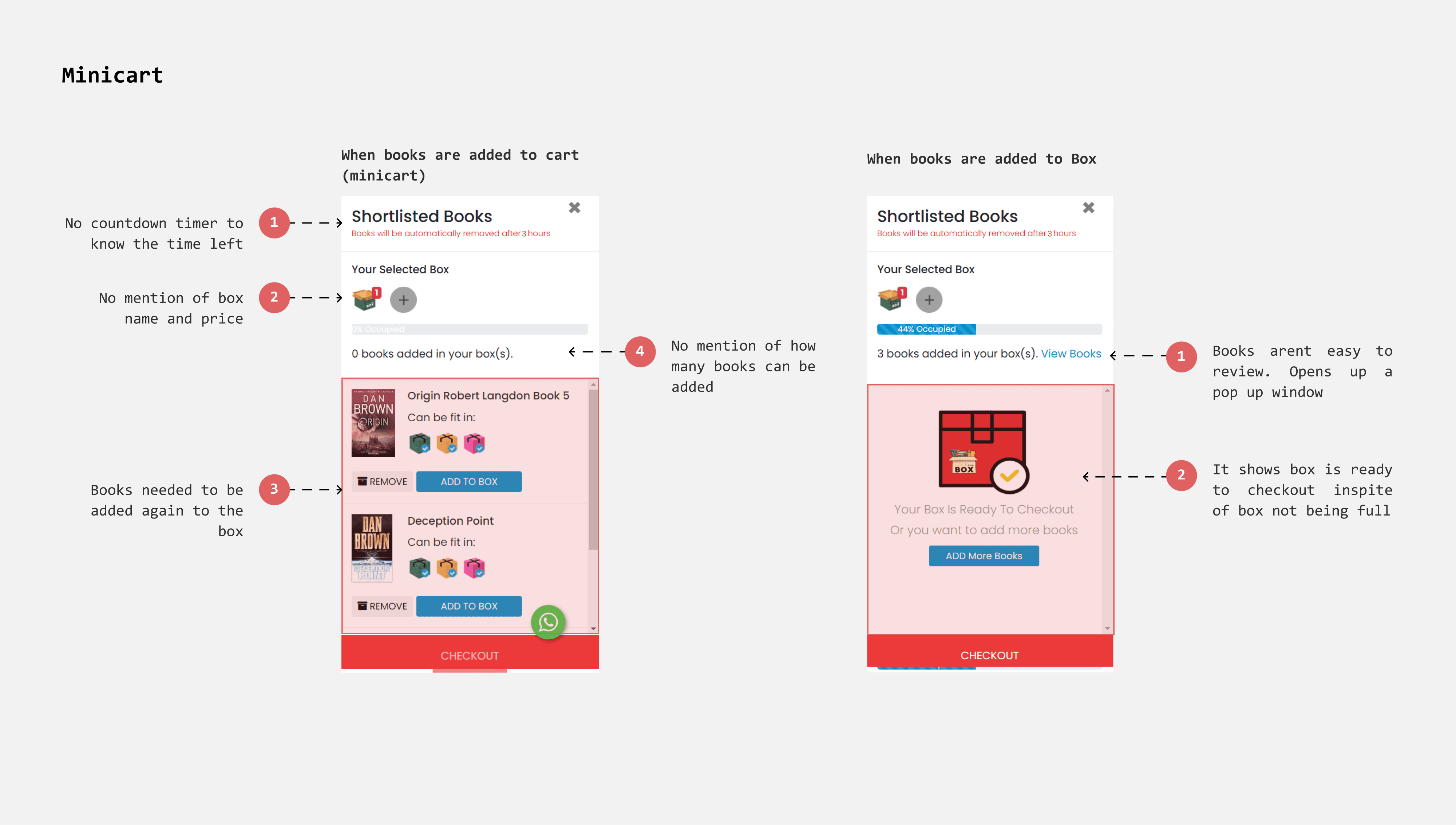
Including necessary information about box
In the existing design, box details are not immediately visible. To improve this, I labeled each box with its name, cost, and capacity. This provides clear information, helping users set expectations and make informed choices.
Making Progression of cart more insightful
Currently, the minicart doesn’t indicate how many more books can be accommodated in the remaining space.
I included an estimate of the number of additional books the box can hold. This provides users with a clear idea of how many more books they can add, encouraging them to maximize the box’s capacity.
Existing
Redesign
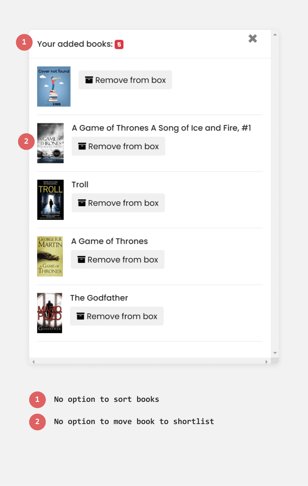
Making the list of books added visible and prominent
When books are added to the box, they are accessed via a link that opens a list with options to delete them. However, users typically expect added books to appear directly in the minicart. The pop-up window complicates and slows down the process.
To improve this, I made the books directly viewable within the minicart, streamlining the process for adding and deleting books and enhancing user-friendliness.
Existing
Redesign
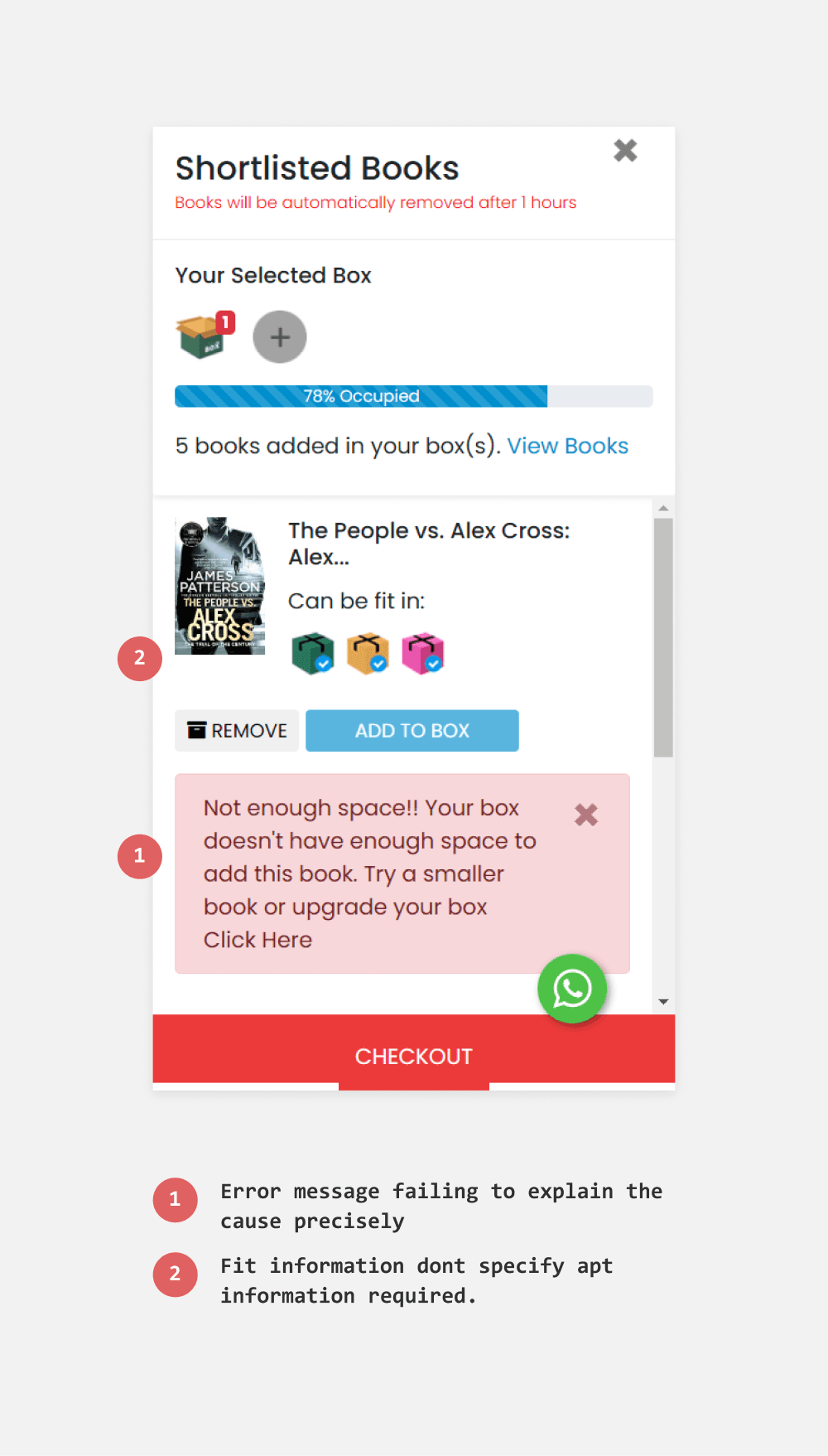
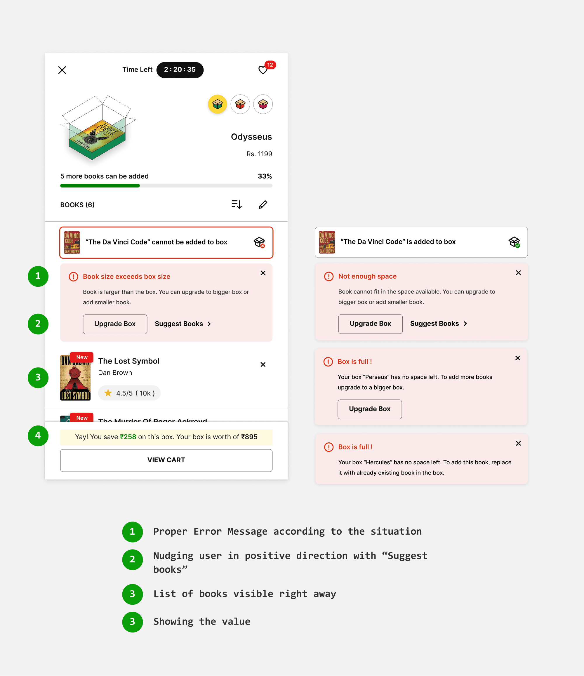
Crafting better error messages
In scenarios where a book cannot be added to the box, the current error message "not enough space" is not always applicable, such as when the book is larger than the box. To address various edge cases, I have crafted specific error messages explaining why a particular book cannot fit. Additionally, the "suggest books" option helps users discover alternative options more easily.
Existing
Redesign
Restricting user from downgrading the box
There can be possible scenarios where users deliberately select largest box to accommodate more books but then check out with a smaller box. To prevent this, I introduced a certain book limit to each box upon which exceeded would restrict user from downgrading. This approach provides flexibility without overly restricting users, allowing them to personalize their choices.
For eg : If users select hercules and add more than 20 books then they are restricted to degrade. And For perseus the limit is 15.
In the box - shopping cart
Allowing users to reconfirm and review order
The checkout process currently takes users directly to the address page, with no option to edit the cart, leaving them unsure of their order details.
For a smoother checkout experience, I added an ‘In the Box’ page (cart page) where users can sort, delete, and modify their selections. I included an order summary section that provides a price breakdown and the option to apply any available discounts.
Selecting Address
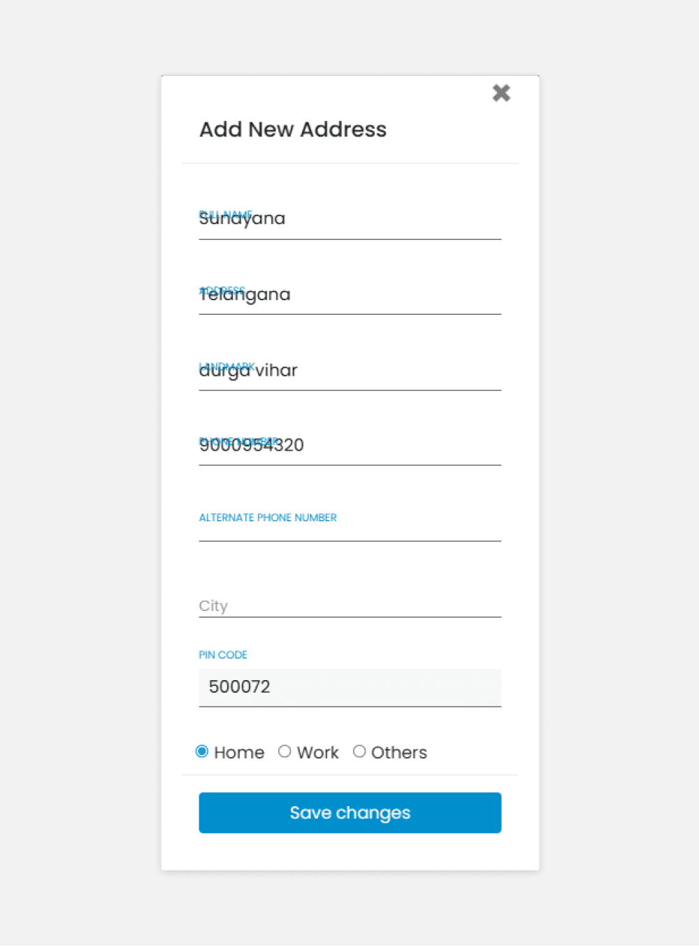
In the current flow, when a user clicks on checkout in the minicart, they are taken to a page where they can select, modify, or add addresses. However, the address filling form lacks proper structure, which can result in inaccurate addresses that are difficult to deliver.
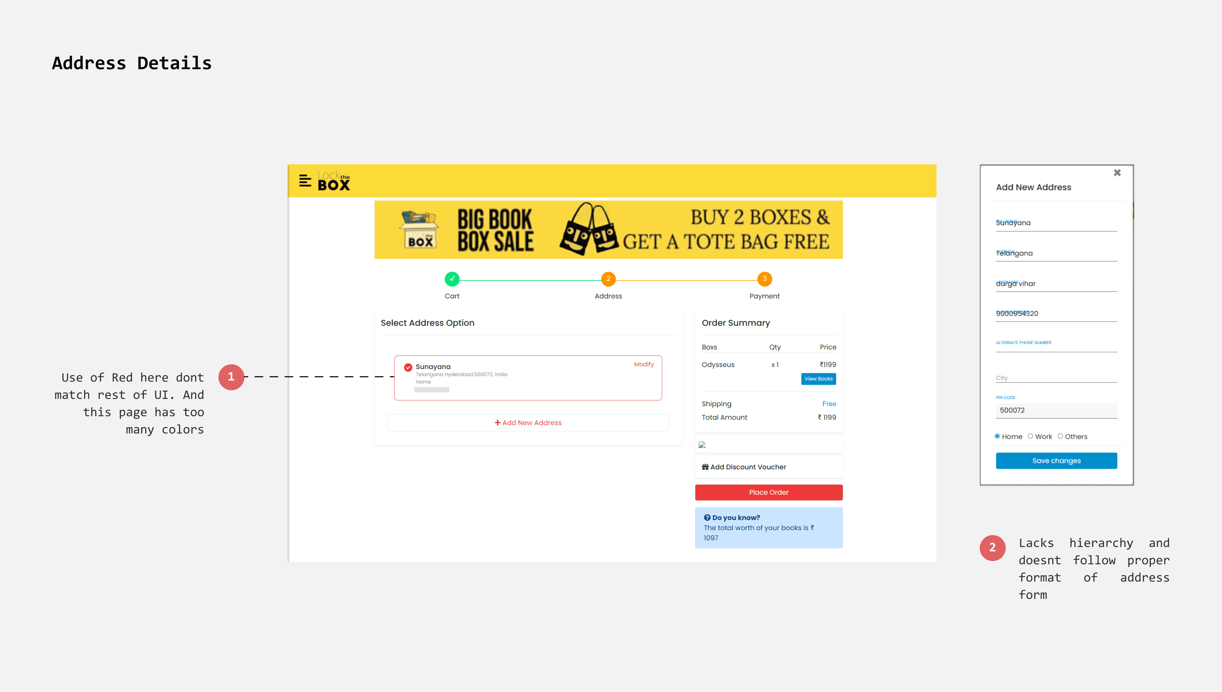
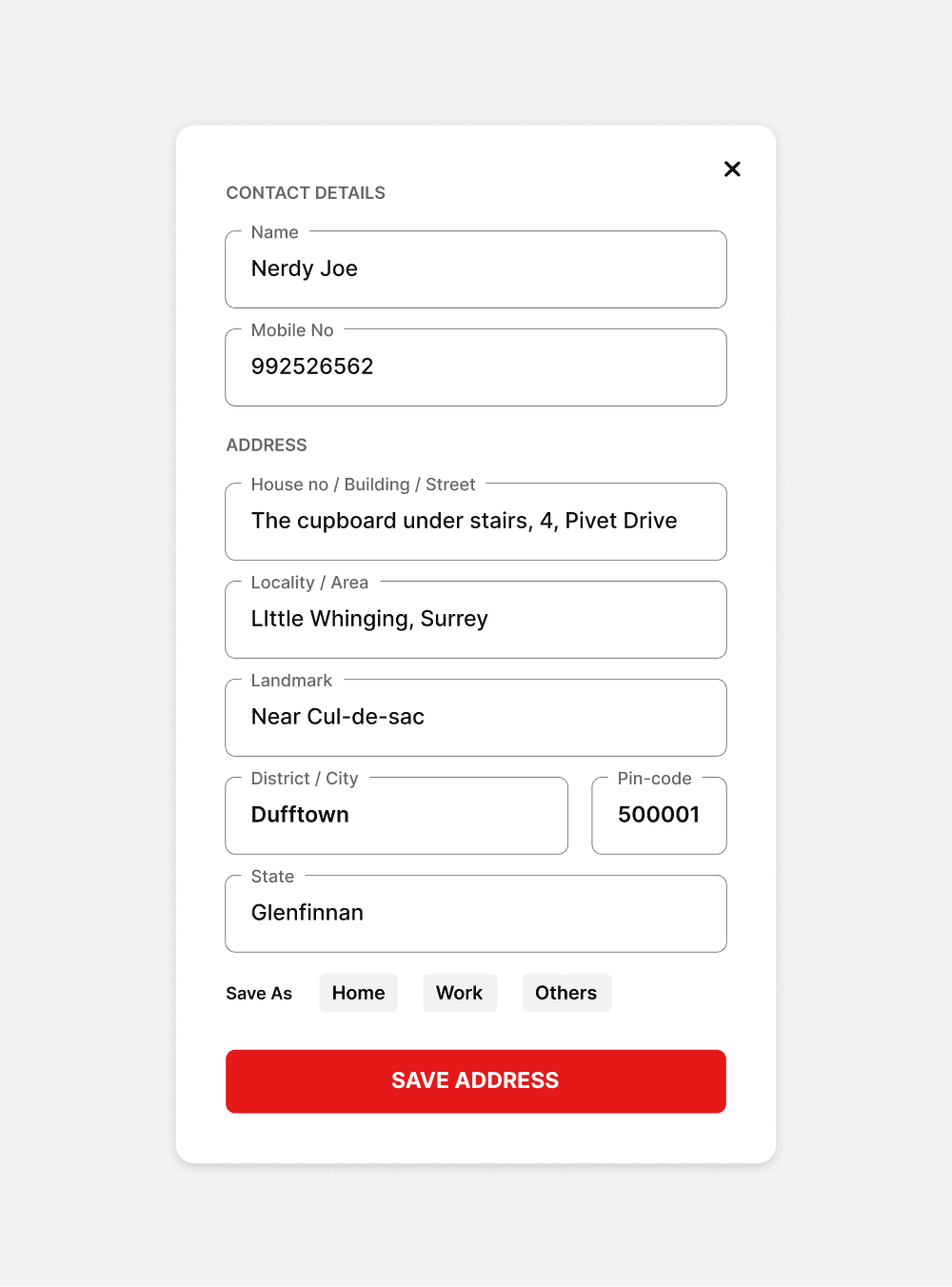
Bringing hierarchy to address filling form
The shipping address form in “Lock the Box” lacks proper structure for details such as house number, street number, and locality. This can lead to inaccurate address information.
I redesigned the address form with a more detailed and structured format, enabling users to provide precise and accurate addresses.
Existing
Redesign
Payment options
The payment page offers two options: "Pay Online" (using the Razorpay payment gateway) and "Cash Payment." However, the lack of clarity about the online payment method makes the page seem untrustworthy, causing users to hesitate and opt for cash payment instead.
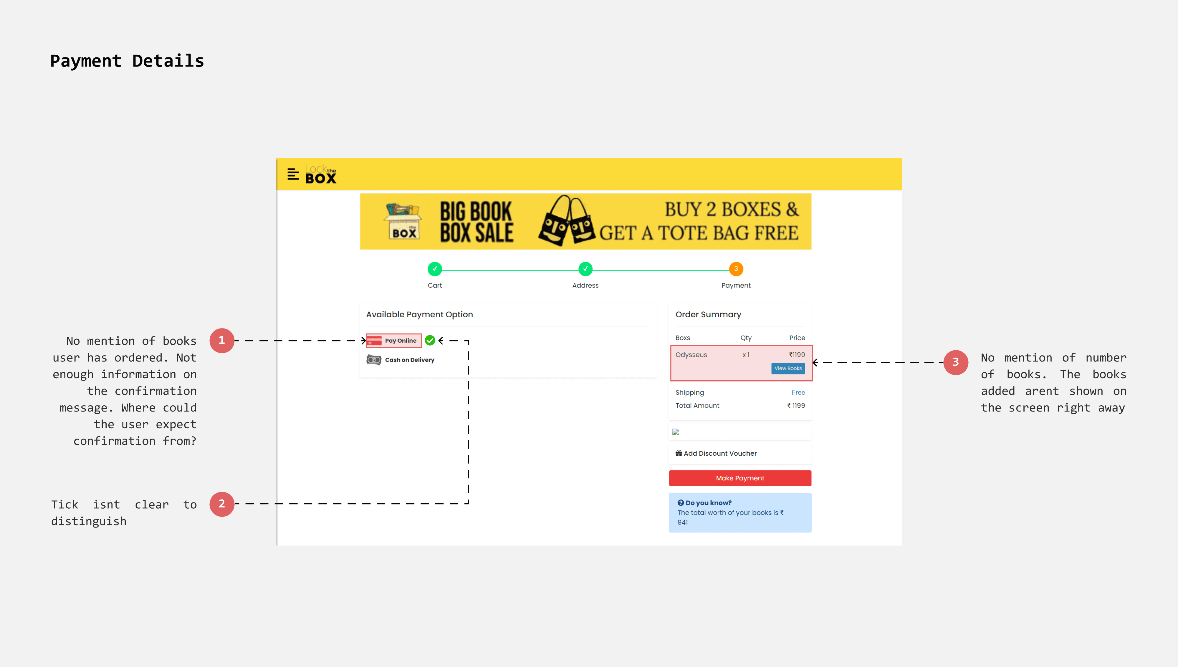
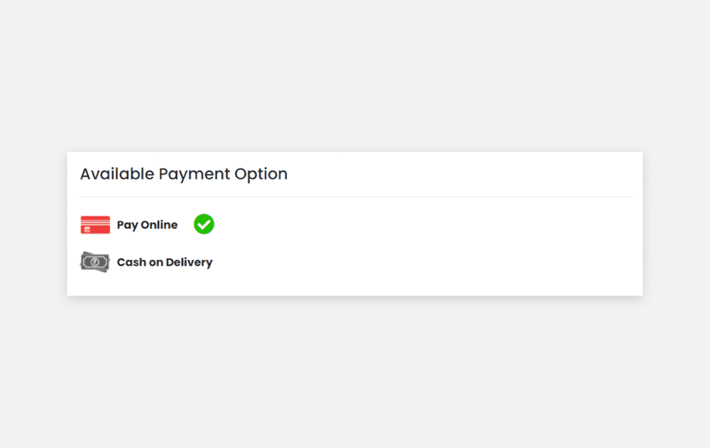
Maintaining transparency with payment methods
Lock the Box uses Razorpay for payments, supporting UPI, card, net banking, and more. However, the payment page previously listed only "Pay Online," without specifying these options.
I redesigned the page to clearly describe the available payment methods and used radio buttons for easy selection. This informs users about their payment options and reduces the likelihood of cart abandonment.
Existing
Redesign
Order Confirmation
Currently, the page lacks essential information that reassures users of task completion. I redesigned the layout to present the information more effectively and reframed the copy to accurately guide users through the next steps.
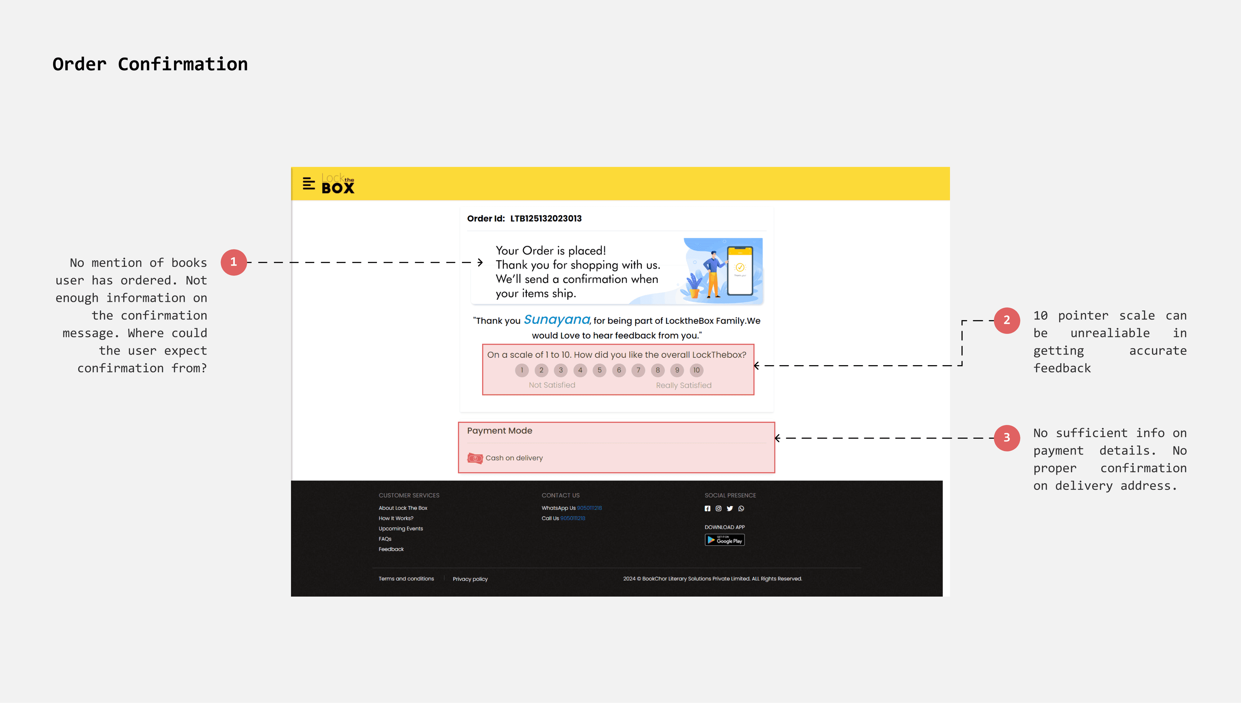
Showing essential Order Information
The order confirmation page currently lacks essential information such as the delivery address, order details, and total cost. This omission can confuse users and make the page appear untrustworthy.
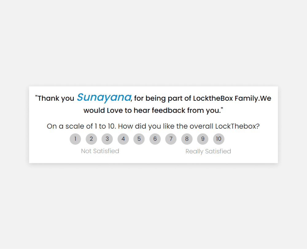
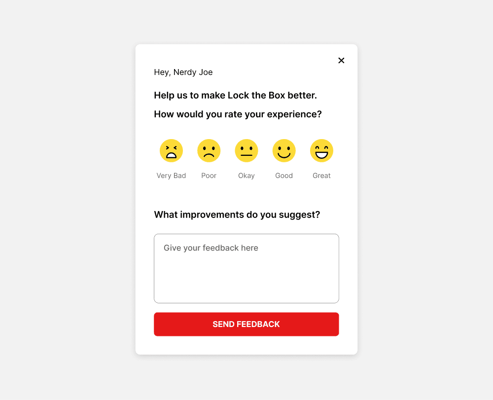
Implementing a better feedback method
On a 10-point rating scale, interpretations of each number vary, making responses less effective for measurement. A 5-point scale, enhanced with emojis, is more intuitive and clearly conveys user intentions.
Existing
Redesign
TAKEAWAYS
Lock the box helped me refine my visual design skills. I learned to design icons, buttons, and elements with consistency, and I gained a better understanding of spacing, hierarchy, layouts, and maintaining grids.
It was challenging and rewarding to design within constraints—such as a timed cart and limited cart space—as I learned to design for different use cases.